City of Asylum: Pittsburgh
UI, UX, Research
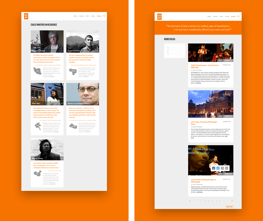
City of Asylum/Pittsburgh offers "Writer-in-Residence" opportunities to writers who have been displaced due to political unrest
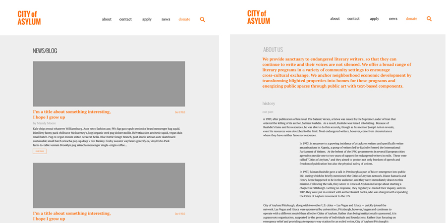
Because City of Asylum (CoAP) does such serious work, their current site design seemed to miss the mark a little bit. Russell and I both agreed that we wanted the site to feel more reverent and serious, while at the same time fresh and new, in contrast with the disorganized and outdated current site. We wanted the site to focus more on the writers they are currently helping and have more of a straightforward menu design.
Clearly communicating the organization's goals to
build trust in community members
We carried this aesthetic into the news and writers' pages, hoping to keep the organizations goals, and international focus immediately apparent to the user.
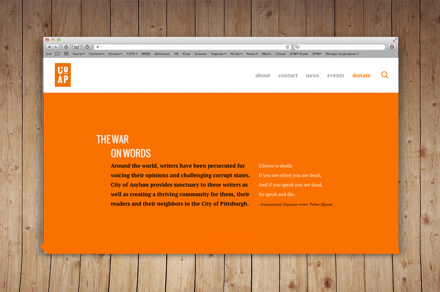
Putting the organization's goals in plain language on the front page, was one of our main priorities during the redesign to create a sense of transparency between the organization and the visitors to the site.
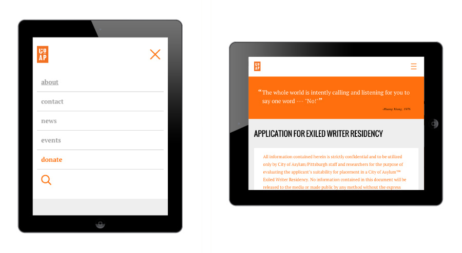
When the site is viewed on a tablet or in mobile view, the menu adapts to make it more accessible to users, and larger text makes the site accessible to people viewing it on these devices.
One of our last, finishing touches was to insert quotes from the exiled writers on certain pages, to elicit an emotional response from users, and to connect them more to the writers' personal experiences and writing styles.
Making the site accessible to viewers on small screens
in underdeveloped countries and Pittsburghers on the go
Me and Russell were really adamant in trying to implement a very clean web design, to compliment the existing cluttered site. This was because although there will be Pittsburghers and English speakers visiting the site, there will also be people visiting who don't have very fast internet connections and who may not speak English. Even in our process work, we strove to make the use of the site evident to all who used it.
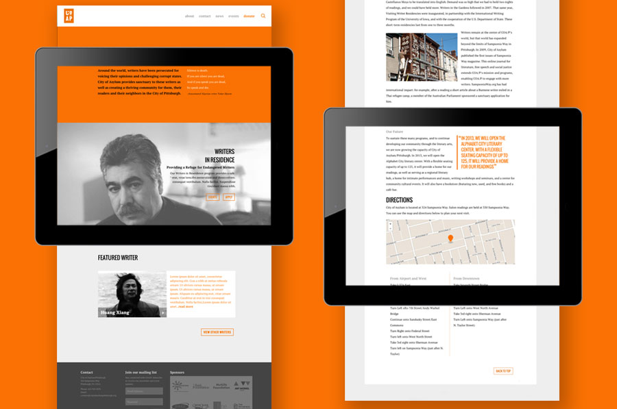
We tried to carry the clean aesthetic of the front page throughout the rest of the site as well, informing the way that we dealt with large bodies of text and images.
This made it easier for us to adapt the site for mobile and tablet versions, ensuring that users of any background could access the site, and that the site would look great across platforms.
These are some of our earliest sketches of the site.
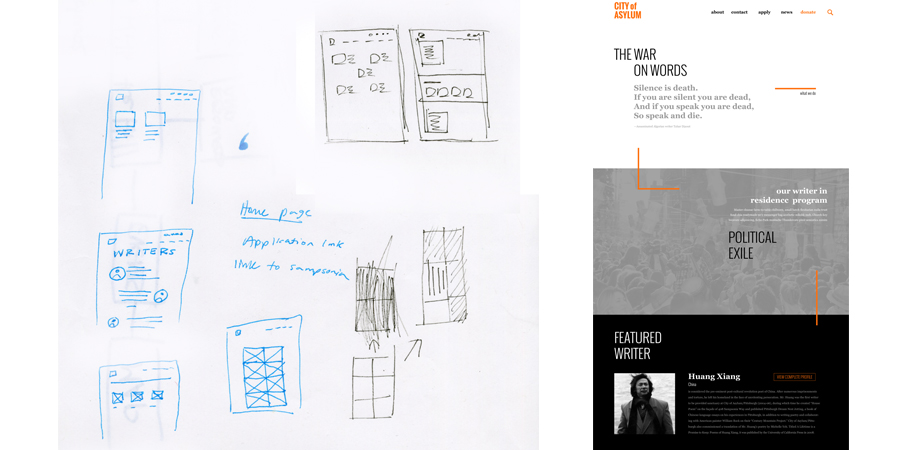
We immediately decided to make the writers page the centerpiece, because the organizations entire existence is based in the goal to help them.
We also decided on a very simple modular grid system. Although we later found the perfect balance of seriousness, and simplicity, our early explorations seemed very dull.
© Copyright 2019 garvey smith