Gen
UI, UX, Research
Use your interests to learn language. Meet Gen.
Gen is a platform for non-native speakers to learn Japanese by leveraging their interests to craft tailored lesson plans. From cop dramas to J-pop lyrics, Gen is an innovative way to guide learners by using what their familiar with to enable them to pick up new skills along the way.
Background
Goal How can we better assist Japanese language learners to learn through their interests?
Why? Language learners have a particular problem set when it comes to finding content that matters to them and finding native speakers with whom to practice
Key Flows
- User created content
- Social media interactions
- Spaced repetition
- Interactive lesson content
Team:
1 total
Product Design •
My role:
Product Design
UX System Map, UI Design, Animation, Illustration, Persona Mapping, User research (interviewing/qualitative)
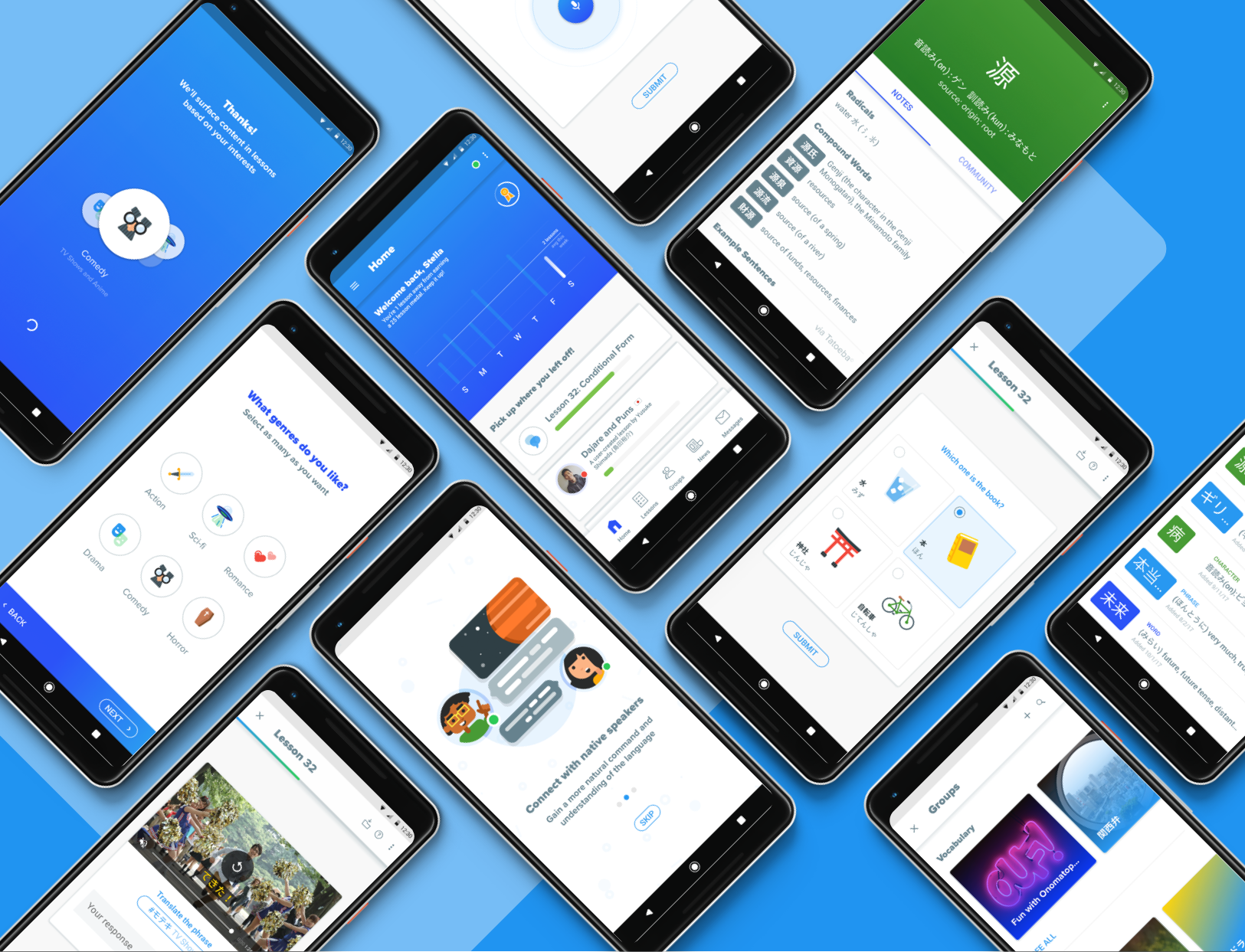
Key Screens
How is Gen different from other services on the market?
Gen is different in two ways. Many language learning softwares currently on the market focus too much on one aspect of three important parts of language learning: social connection, building off of interests and rote memorization. Gen seeks to blend these three learning values where the student can not only learn the language, but use their interests to learn and connect with others.
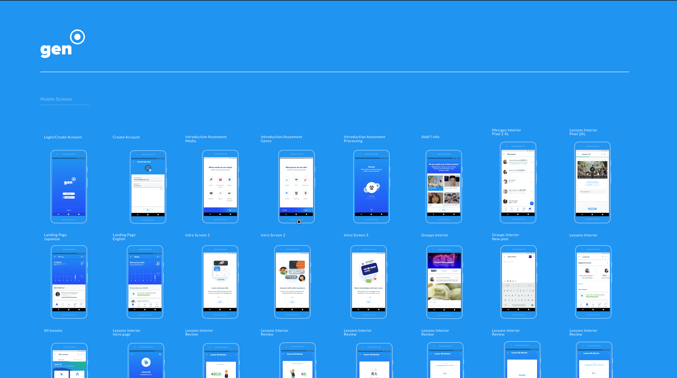
Setup screens for Gen on mobile
Gen is different in two ways. Many language learning softwares currently on the market focus too much on only one aspect of the three important parts of language learning: social connection, building off of interests or rote memorization. Gen seeks to blend these three learning values where the student can not only learn the language, but use their interests to learn and connect with others.
Additionally, by offering the same service to Japanese speakers seeking to learn English, users can communicate cross-culturally more easily to supplement the learnings that they gain from lessons.
By having learners fill out an “Interest Inventory” when they are going through the onboarding flow for the first time, we can match them to content to incorporate into each lesson and, using that content’s devoted tags, spotlight social groups on the site that they can use to connect with other users about what they’re learning.
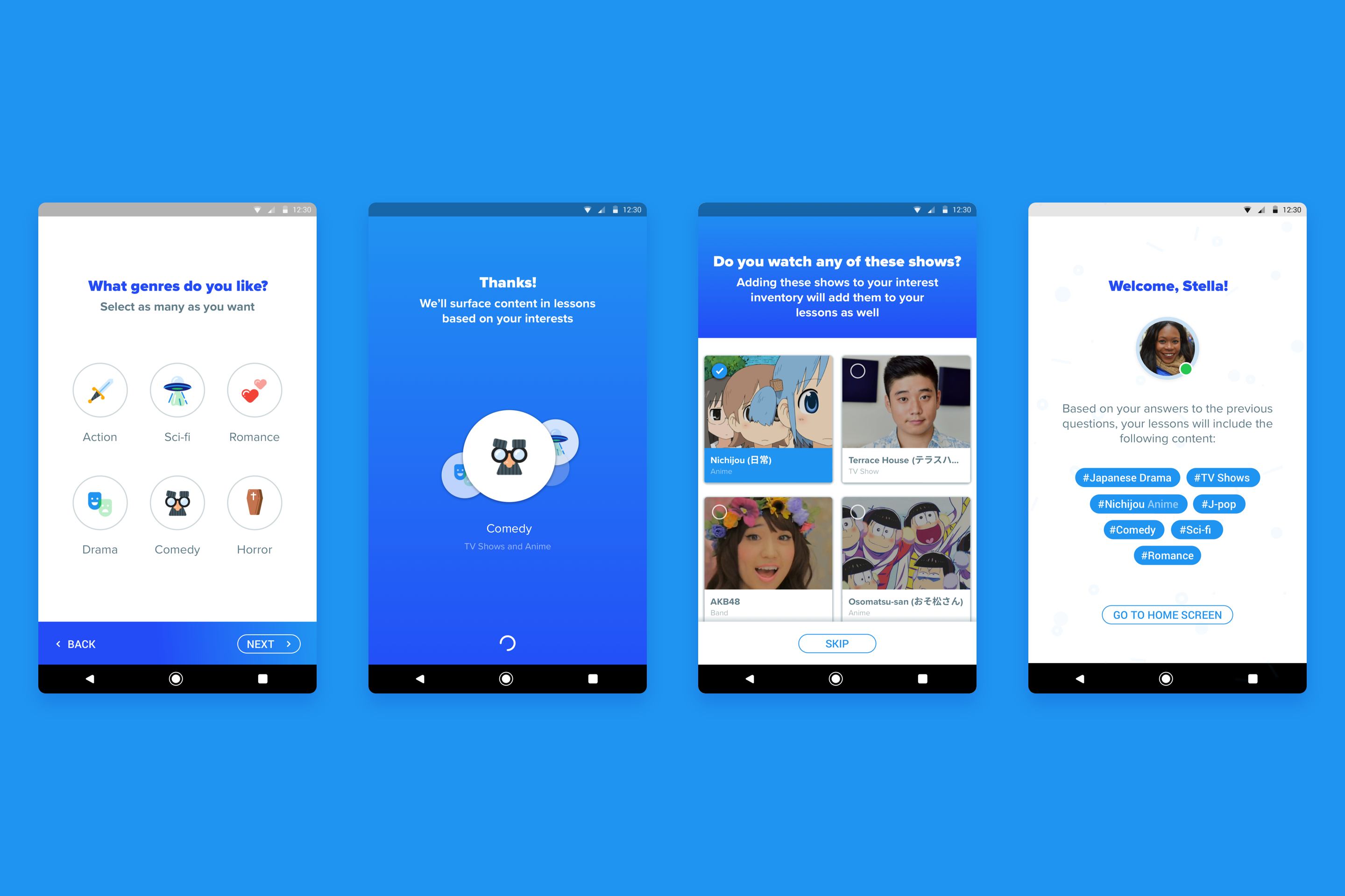
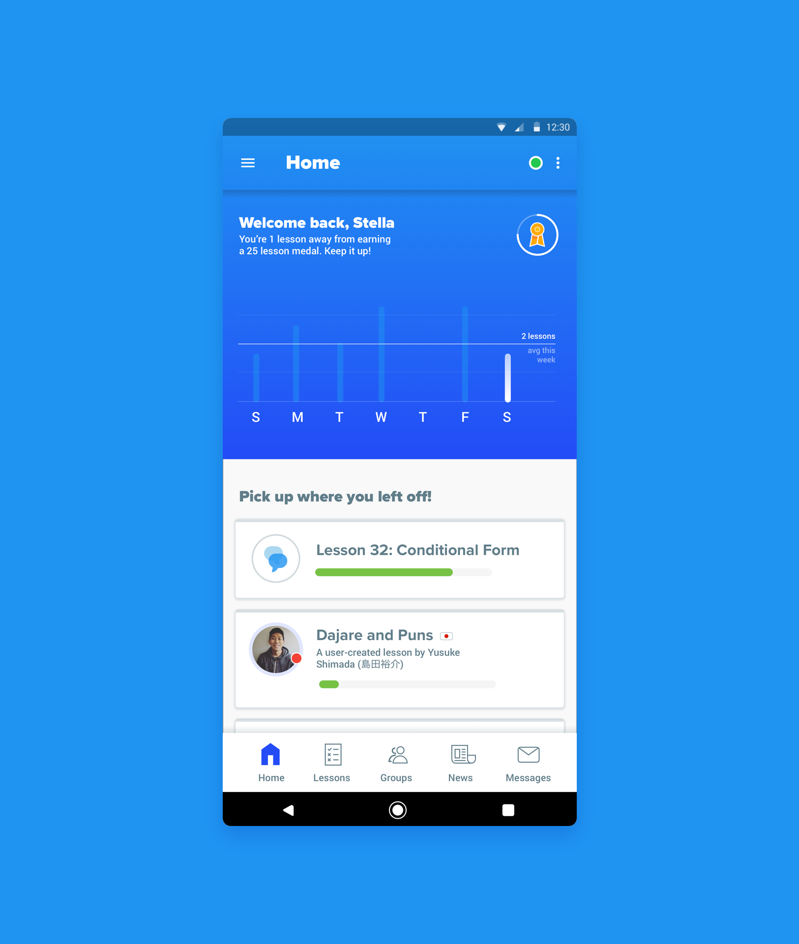
Flow of a user completing the Interest Inventory
There are four ways that users can interact with others using Gen:
The profile page is a space where users can view important info such as which groups other users are apart of, any medals they may have earned from using the app, lessons that they’ve created or completed and any content tags that they follow.
Groups provide a space for clusters of users with similar interests to post about their favorite topics or ask questions.
Outside of the lessons provided for users from Gen, users can also create their own lessons themselves using the user-created lessons UI for unique topics that they think others may be interested in.
Lastly, the direct messaging UI gives users yet another way to communicate with other users in a social way. In this view, users can communicate in English or Japanese and offer suggestions on ways to improve incoming messages sent by others.
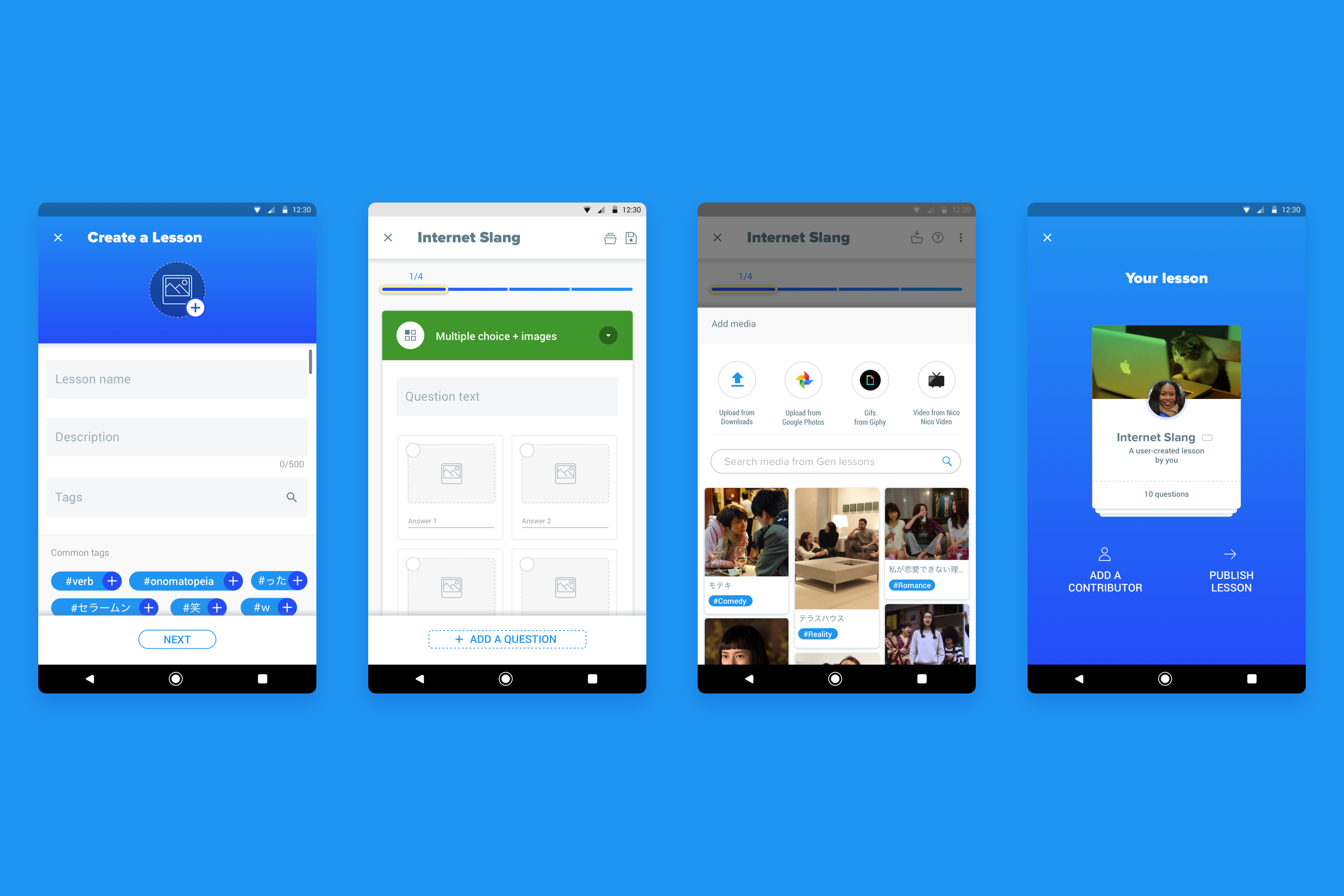
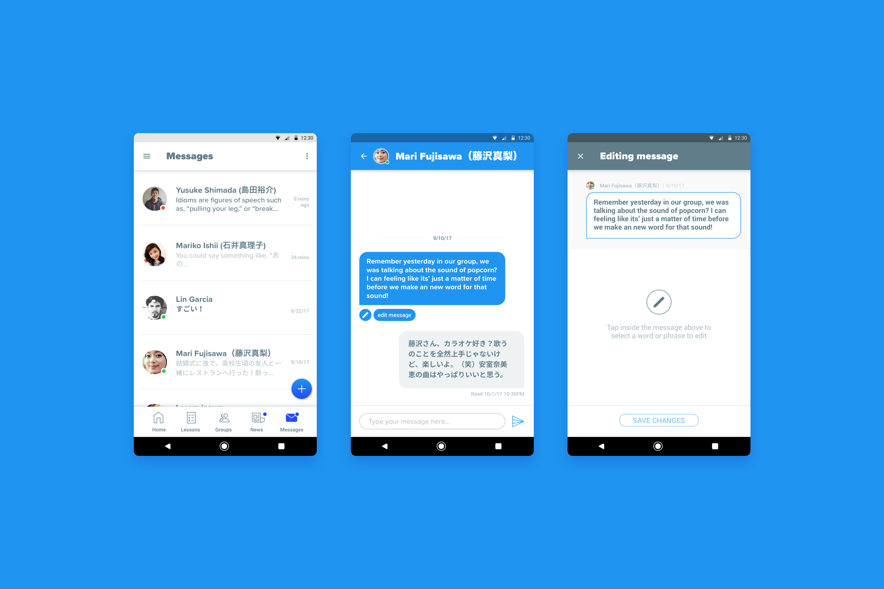
Examples of creating a user-created lesson, direct messaging UI (with message editing)
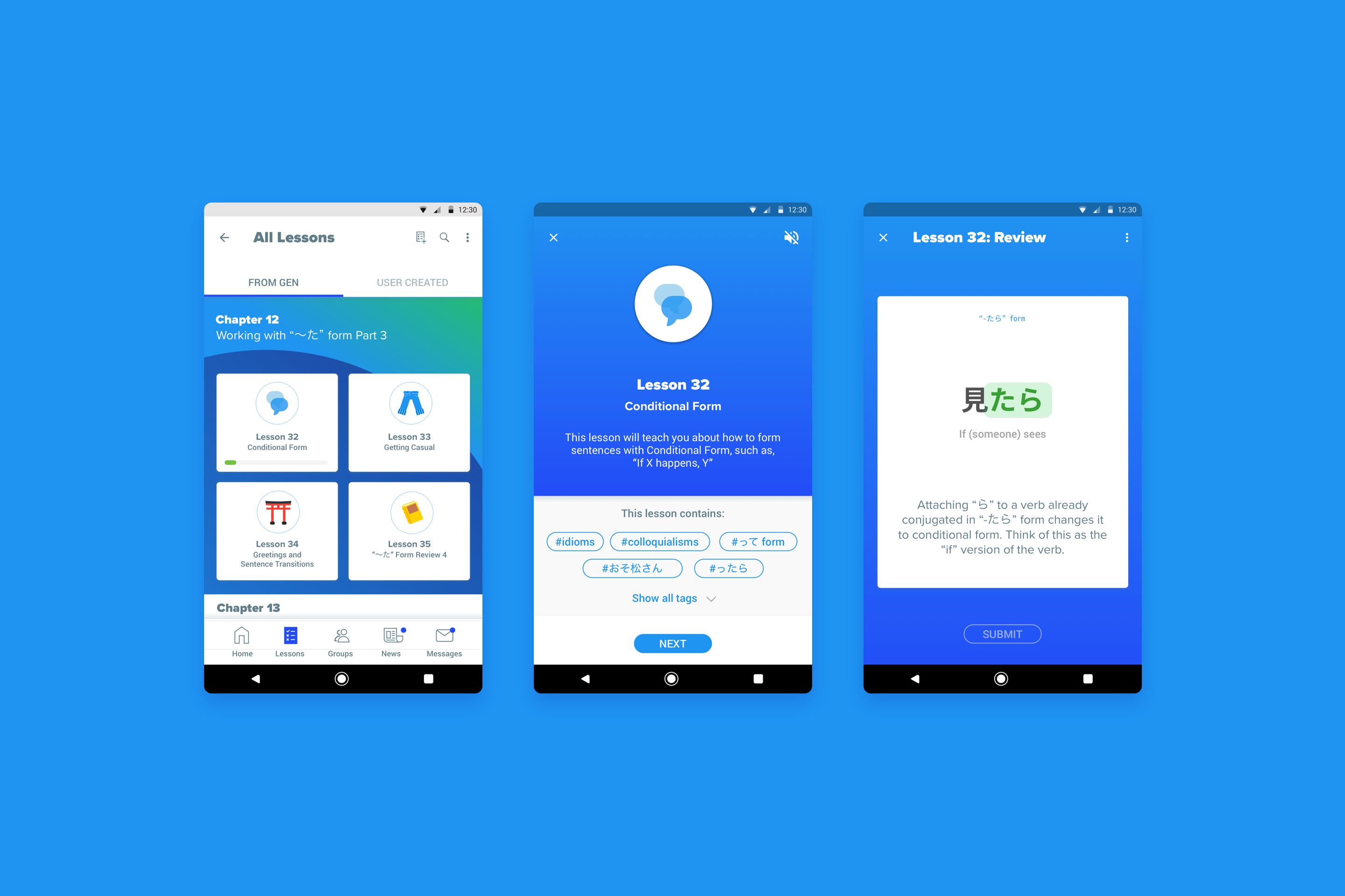
and lesson interior screens
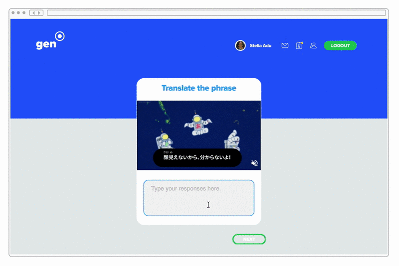
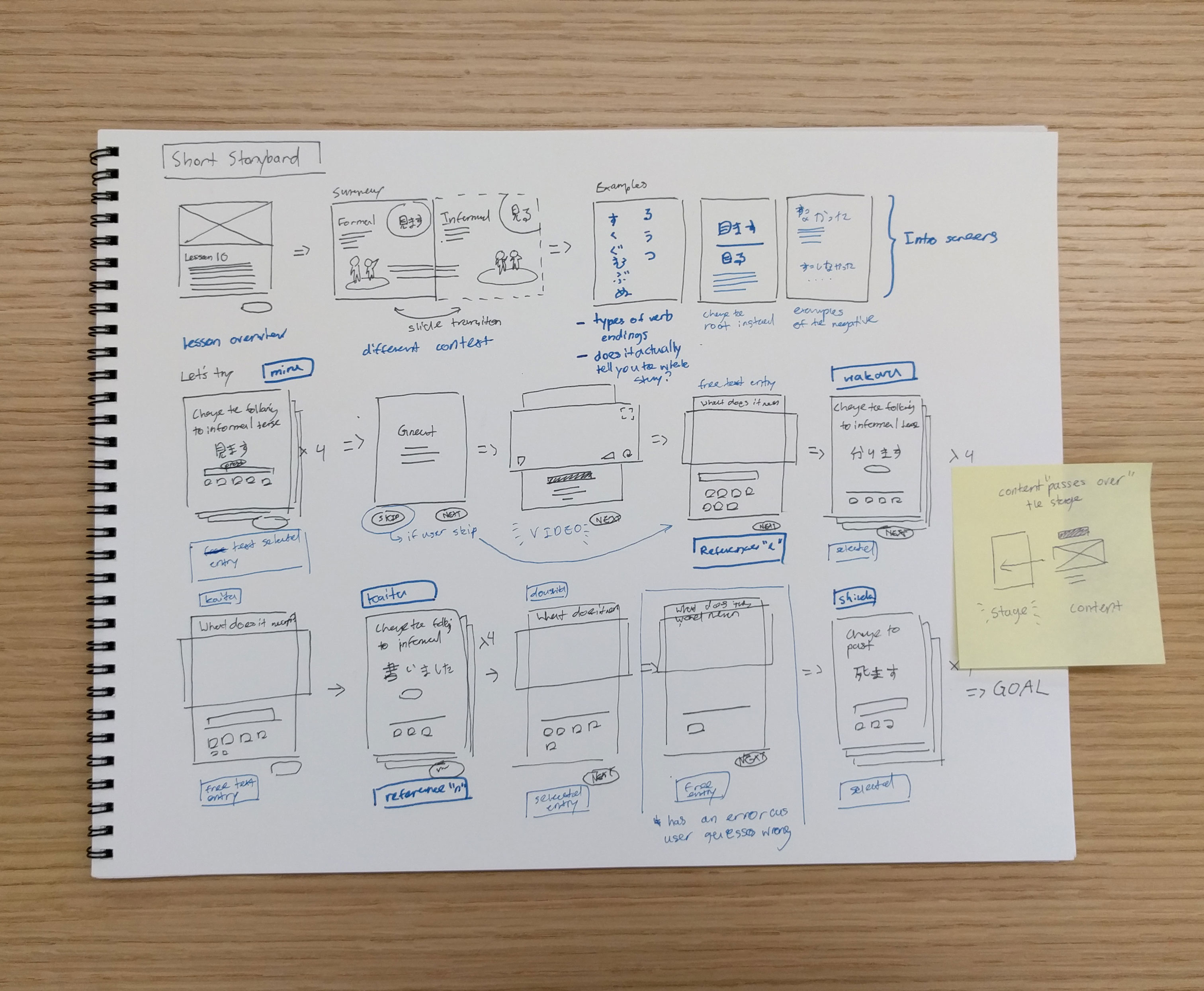
When going about building out what the interior screens for the lessons would look like there were a few things that I wanted to keep in mind. Having a set of components such as media players, fill in the blank boxes and free text entries that balanced highlighting the higher level concepts being taught through each lesson and allowed the media on each screen to have space for the user to interact with them were my primary considerations. Although I wanted students to experience language learning in ways that helped them learn more about their interests and challenged them, I didn’t want any one screen to try to do too much.
Additionally, when doing preliminary research by reading language acquisition journals, I learned that one of the hallmarks of learning a new language is, “creative language use” which is to say helping the student make educated guesses about what how sentence structures and word use work in their new language and using positive reinforcement to guide them into correcting their language use over time. In order to achieve this, I specifically limited the amount of traditional “translate this word” or “translate this sentence” based questioning as instead of enforcing creative language use, this instead lengthens the amount of time learners spend thinking in their native language.
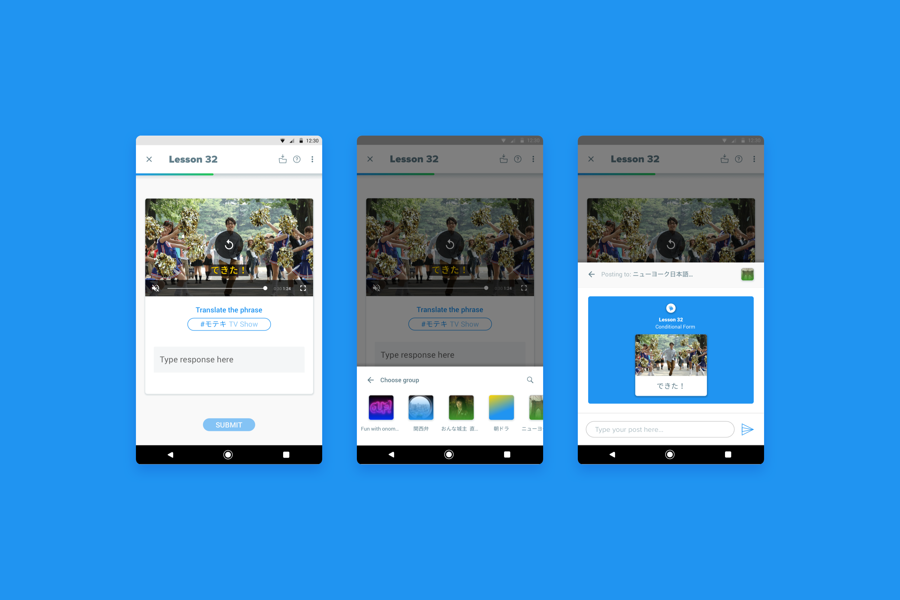
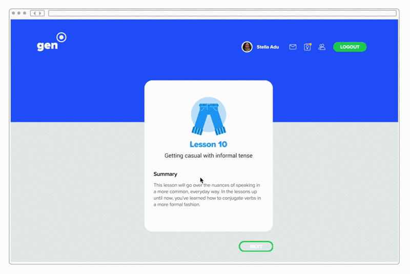
Lesson Interior Example
Delightful details such as the color of completing a lesson successfully are an integral part of reassuring the user and congratulating them on their progress. During my research with teachers and students I looked into effective ways of positive reinforcement and its’ effect on students’ motivation towards learning language.
Bridging cultures through UI
I also needed to make considerations for how people would use the app from English speaking vs. Japanese speaking countries as well. So, I referenced many Japanese apps that I use on a daily basis such as NHK News and Line to surface up the more tech-y lines of UI copy. I also came up with a flag icon that communicated which country the user was from and transliterated Japanese learners’ names into romaji for English speakers and transliterated English speakers names into phonetic katakana for Japanese speakers, so that users could easily pick up on the pronunciation for others’ names in their native tongue.
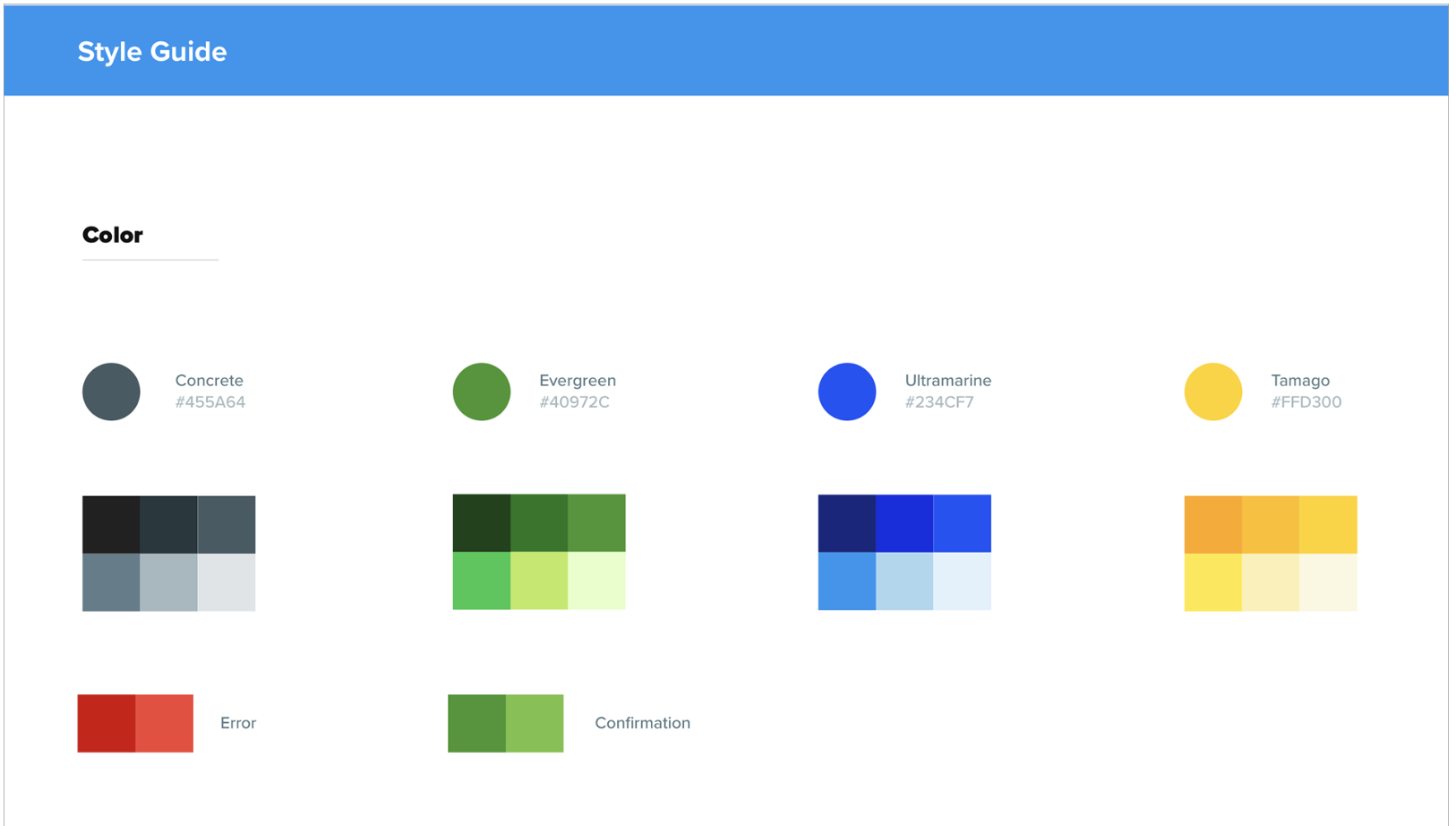
Defining a brand style
As a language learning, I know that acquiring a language can be an arduous task where it’s easy to get disheartened, so I wanted to make sure that the style was airy, approachable and inviting. The yellows, greens and turquoises that guide the style language of Gen help to enhance the friendly nature of illustrations with rounded corners.
Research
The visual evolutions of many of the interior pages of Gen
Although early in the design process, I went with darker color scheme for the backgrounds of the interior lesson pages and an even more bubbly appearance on the other pages, during testing many people complained about the darkness and found it to be more suited towards apps that have a more strong media focus (i.e. Netflix or Spotify).
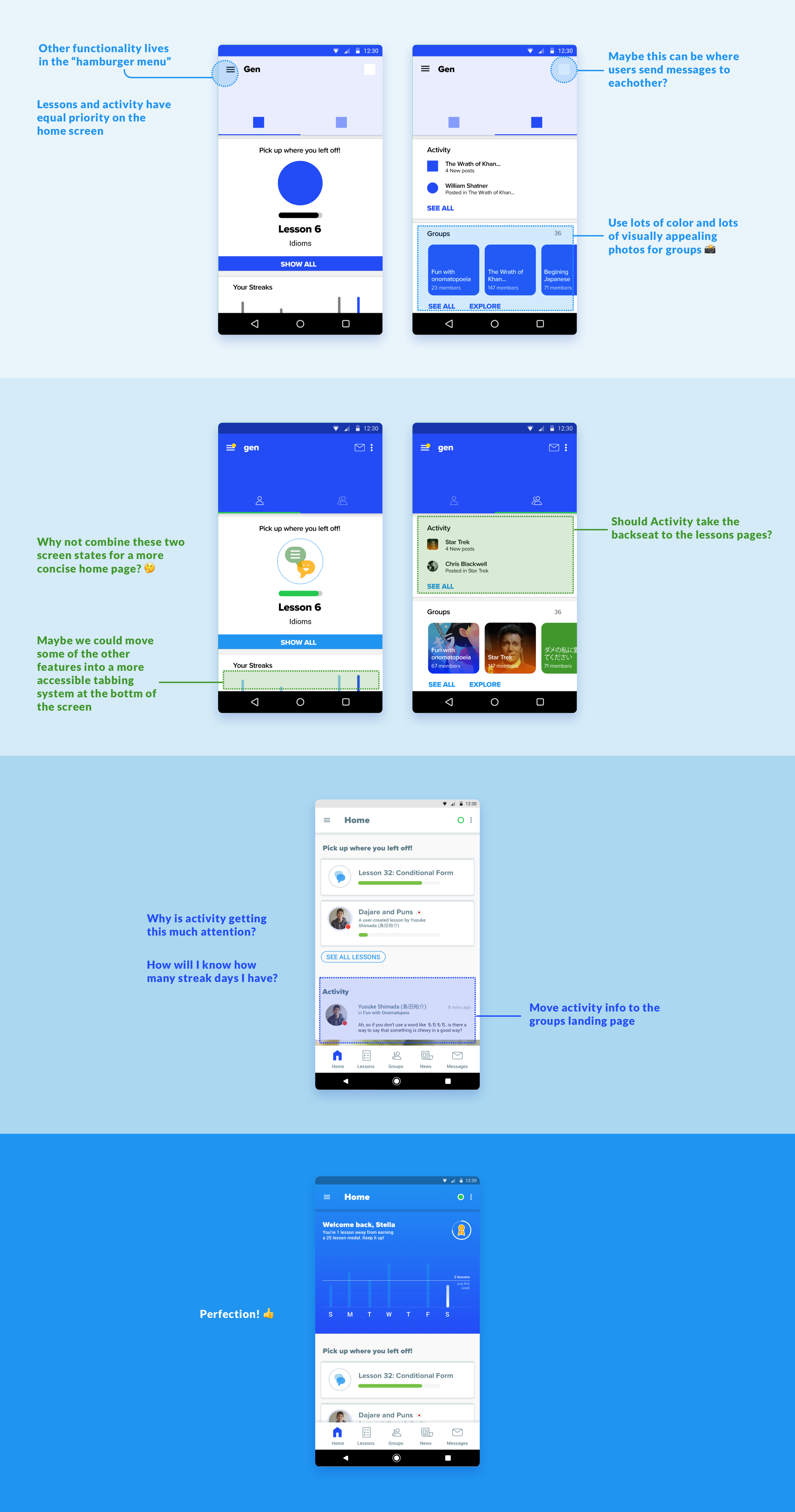
The evolution of the landing page through research feedback
Conducting research
Early in the process it became apparent that I would need to get feedback throughout the process of creating Gen. From original sketches to the final polished prototypes, I sought out information from language acquisition journals to understand the best practices for learning language, educators for an understanding on what’s worked in their classrooms and learners to get insight on what they thought about my approach to tying learning to their individual interests.
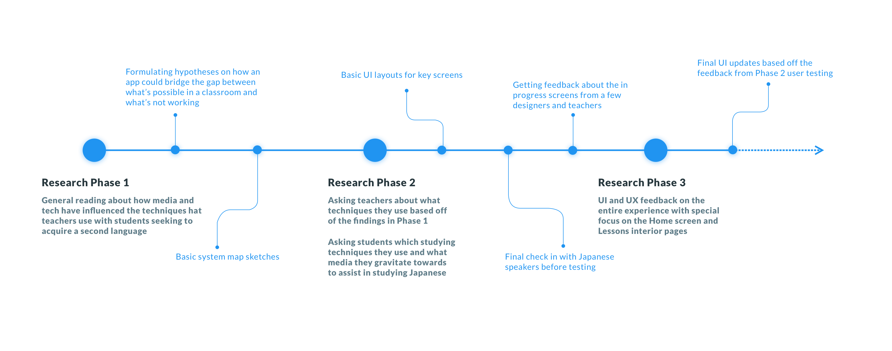
Overview of each research phase that I went through
Research Phase 3
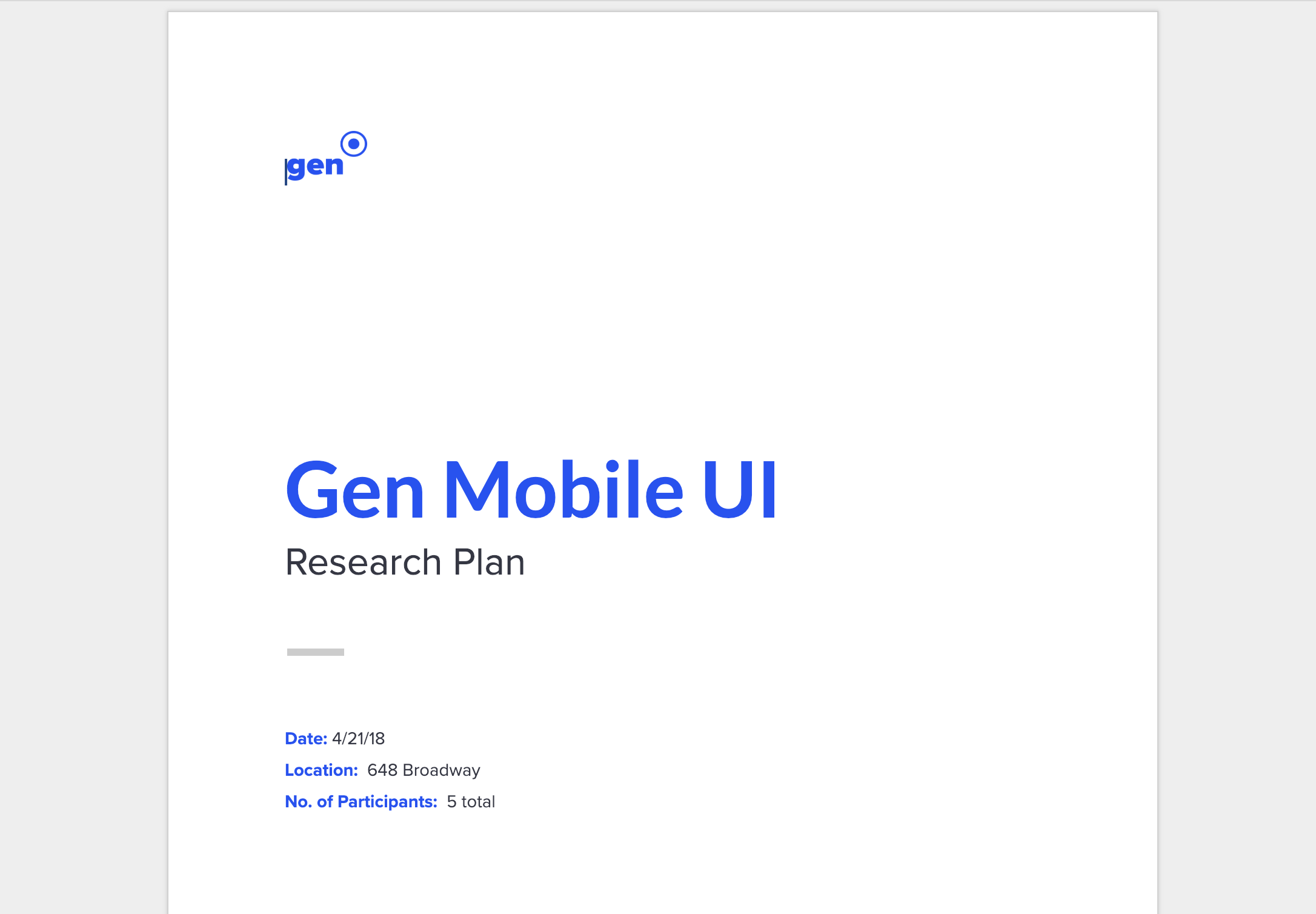
This is the document that I used during the third research stage. It contains the script and final results of the questions that each individual was asked.
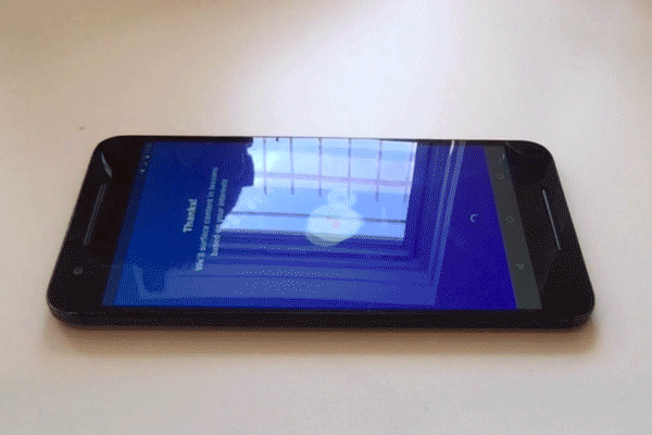
One of the participants interacting with the prototype on my phone
The final stage of research consisted of using the prototype linked below. As I was the only one working on the project, my setup was pretty barebones, but I tried to make it as efficient as possible. Using the script above, I had participants come to a small space that I had rented for the day with a makeshift setup with my MacBook facing the phone that they were interacting with the prototype from. Using PhotoBooth on my MacBook I recorded both the video of them interacting with the prototype, and the audio from my questioning. After 3 rounds of testing with 5 participants (1 individual and 2 groups of 2), I went home and typed up summaries of each of the participants’ responses and consolidated that list into actionable items that I could incorporate into the final screens that are displayed in the sections on this page above.
I also created an example UI of what a web landing page could look like if Gen were real. I wanted to see if users thought this page captured the intent behind it well and most thought it did. I was just having fun at this point, but if you’d like to see this page, click here.
Research Phase 2
For the second round of research, I created a small prototype with video and text input functionalities to see if I could get feedback on the language learning experience as well as media integration. The prototype also has the on-boarding flow and site landing page.
At this please, I was still convinced that the main usage would be via desktop, but users who went through testing with this prototype thought that they would primarily use the app on their phone instead.
My UI sketches for Gen in preparation of building wireframes to test with.
Research Phase 1
Although I speak Japanese and have minor knowledge of some of the core values of Second Language Acquisition (SLA), I wasn't quite sure where to start when designing Gen. Part of my initial research were to read a few books on the subject.
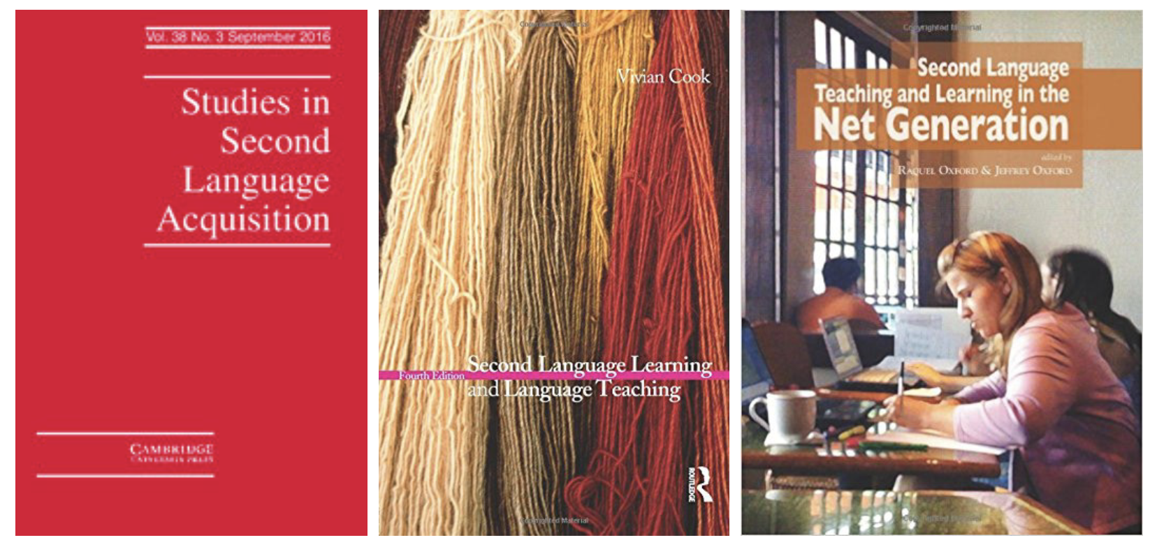
Some of the books that most aided me were Second Language Teaching and Learning in the Net Generation by Jeffrey and Raquel Oxford, Second Language Learning and Language Teaching by AJ Cook and the journal/magazine, Studies in Second Language Acquisition.
All of these readings helped me to create a framework for what I wanted to do. They also assisted me in the development of what an example curriculum could look like and provided some insight into which language learning and assessment strategies are most useful for students.
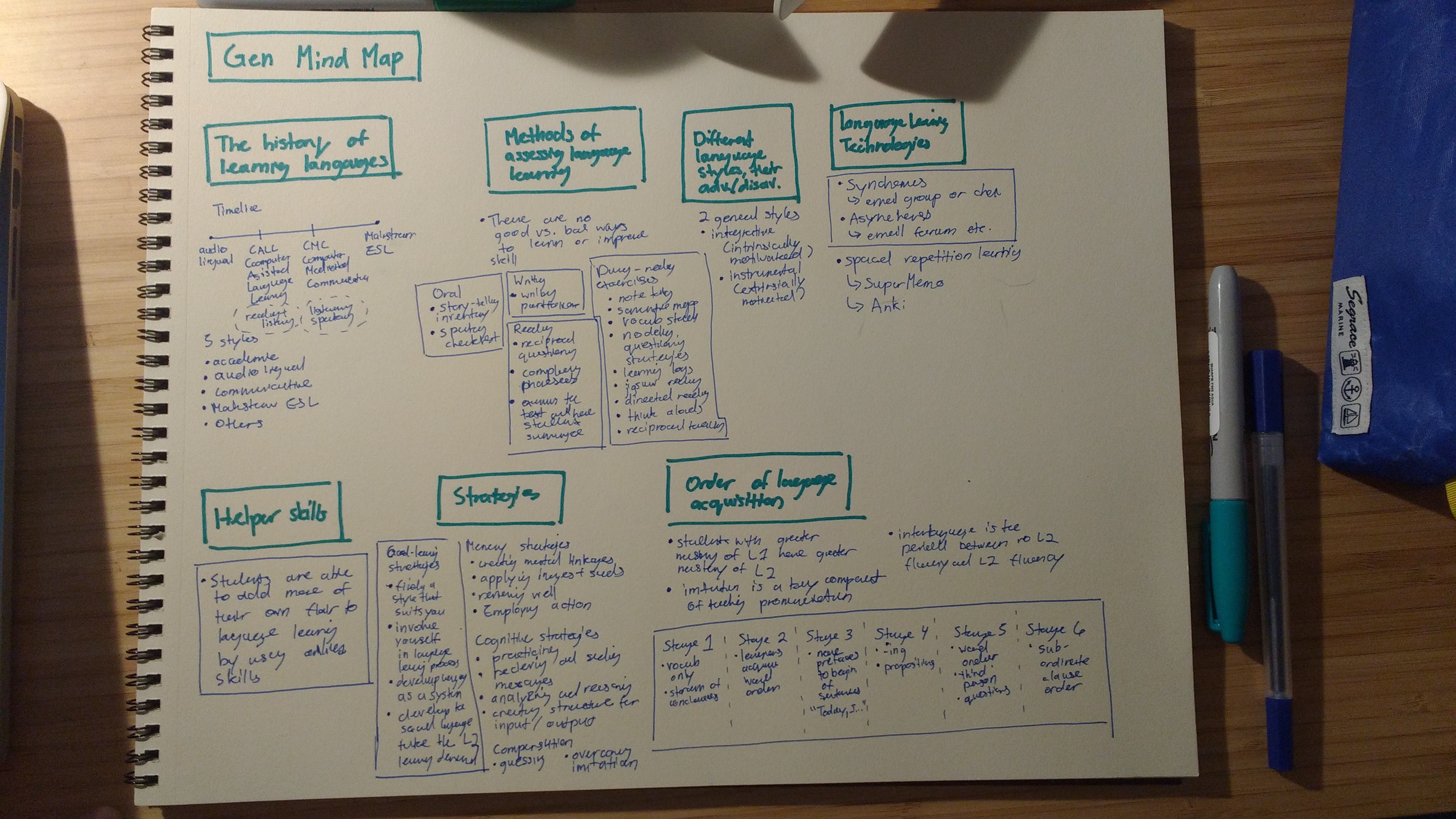
First image: The mind map that I created after reading the books and brainstorming on the types of interactions that I felt students would learn the most from as based off the authors’ examples.
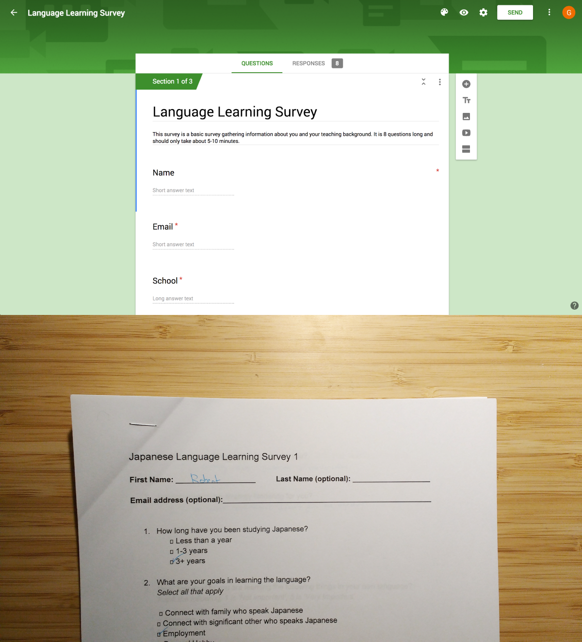
Second image: The surveys I sent to students and teachers.
Although the books that I read helped me in deciding on how the lessons should be structured, I still needed to make sure that the ways that I wanted to integrate media into them would make sense to users, for this I decided to have current language Learners and teachers fill out a short discovery survey.
I personally know many students who are learning Japanese, but not as many teachers who teach language, so I used the internet and reaching out to some friends to get a hold of them and look into their responses.
I learned a lot from this survey and many of the responses influenced the final design of the app.
For example, learned that both teachers and students found it hard to find ways of getting to interact with native speakers and accordingly, that it was hard to find material to use with learning that was relevant to the student’s interests.
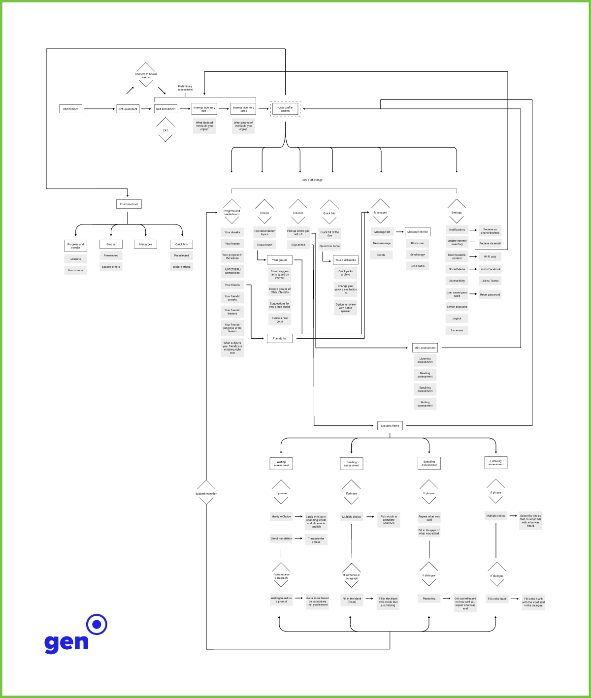
System map for Gen
© Copyright 2019 garvey smith