Moto Body
UI, UX, Research
Stay active, live better with Moto Body
While working at Motorola, I've spent a majority of my time contributing to Moto Body, a health and wellness app built to present your data in clean ways. While designing MB, we included numerous ways for users to challenge themselves and by extension, live better.
Background
Goal Leverage the Moto 360 watch’s capabilities to assist Moto owners in meeting their fitness goals and hook them on the Moto ecosystem of apps
Why? We weren’t utilizing the full potential of hardware in the 360 and were investing considerably in building a holistic ecosystem
Key Flows
- Indoor/Outdoor Run Summary
- Heart Activity + Calorie Burn
- Goal Setting
- Running Notification
- Calorie Counting (deprecated)
Team:
20 total
Software Dev (3 remote: Bangalore) ••••••••••
Hardware Dev ••
Project Managers ••
Product Strategy ••
UX Design ••
UX Research •
Visual Design ••
My role:
Visual Design
UX System Map, UI Design, Persona Mapping, User research (interviewing/qualitative)
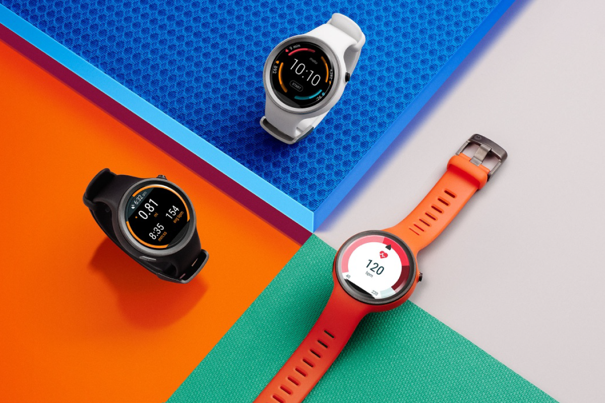
Key Screens
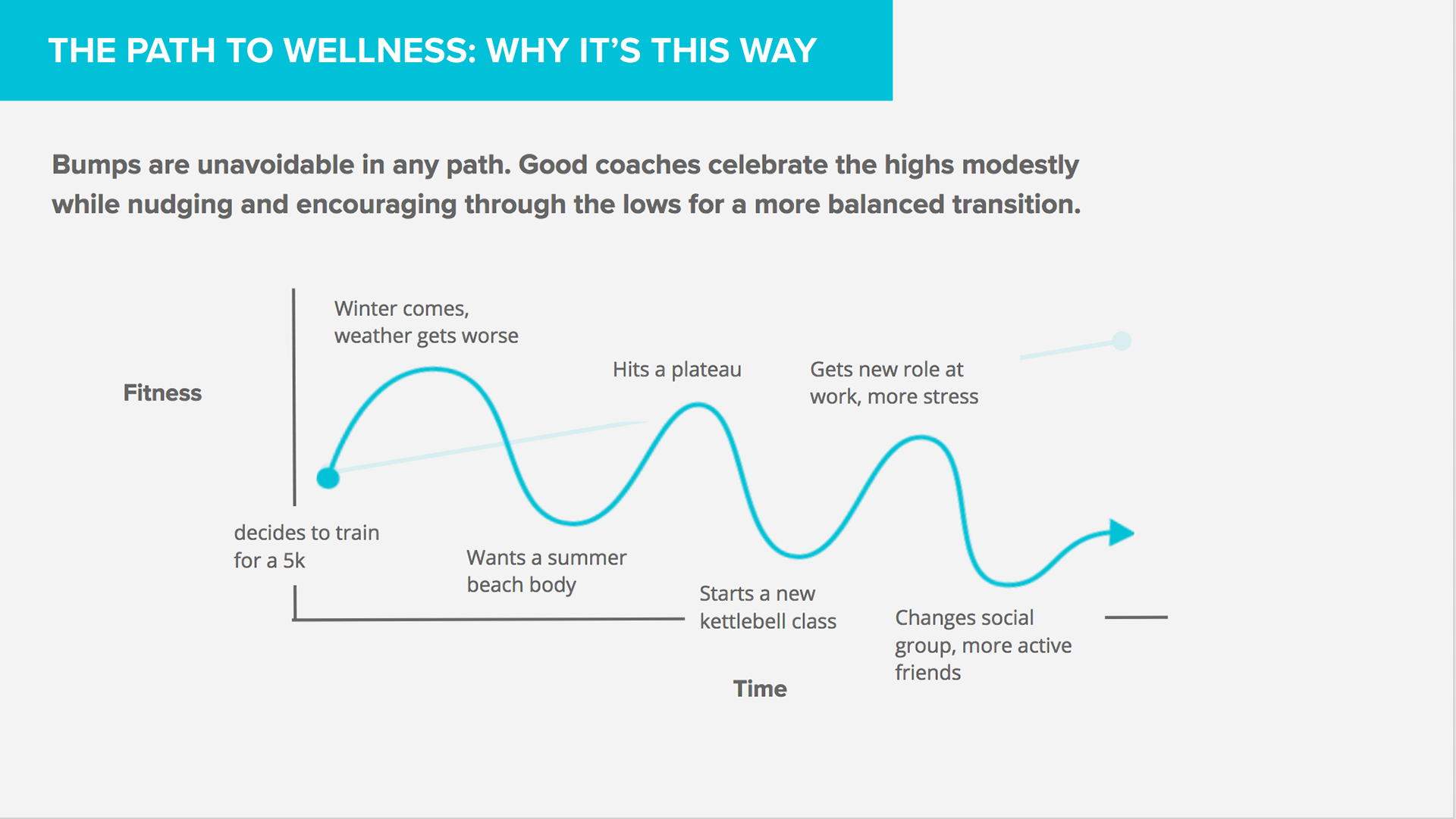
How did we go about improving consumers' fitness?
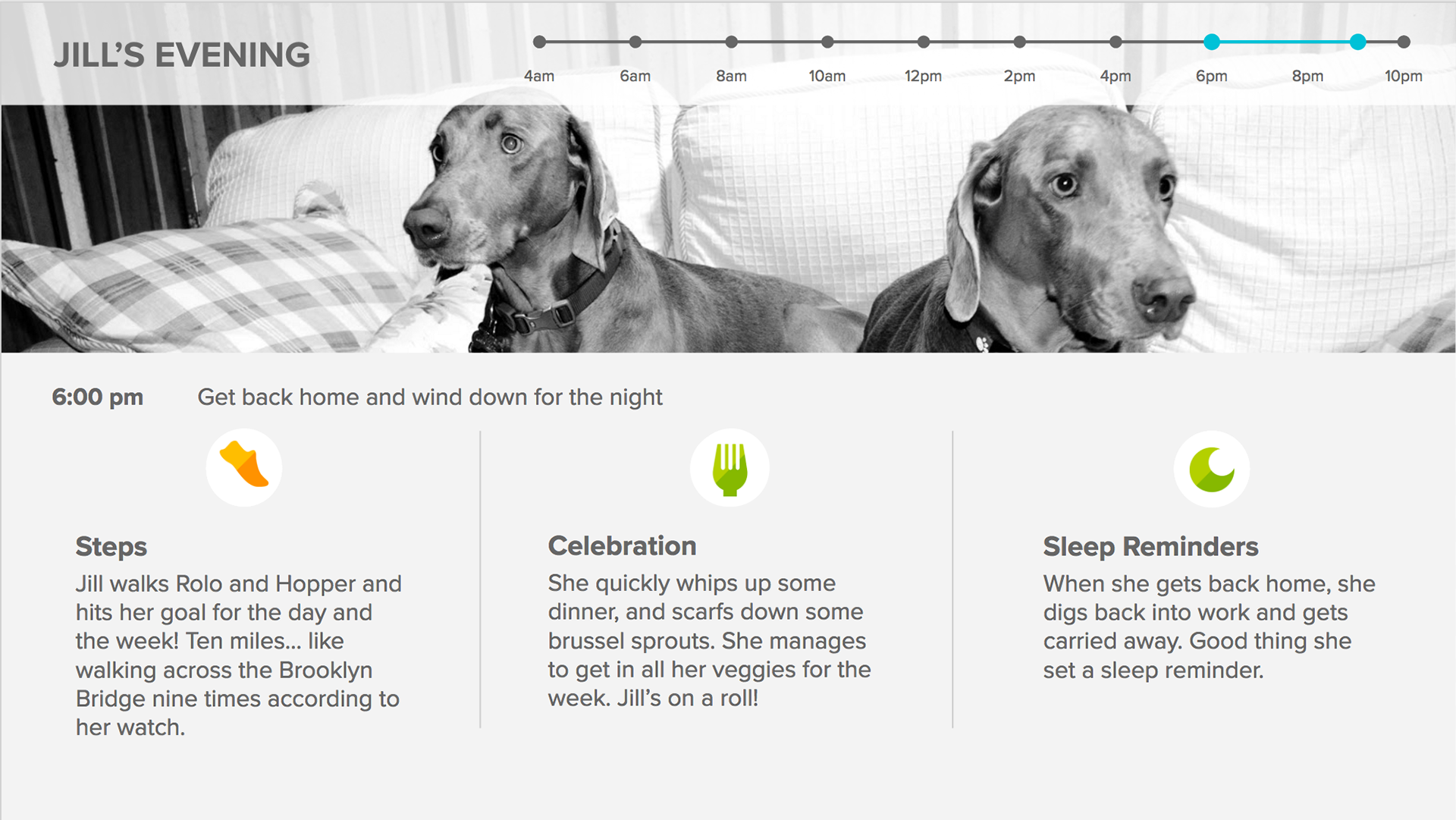
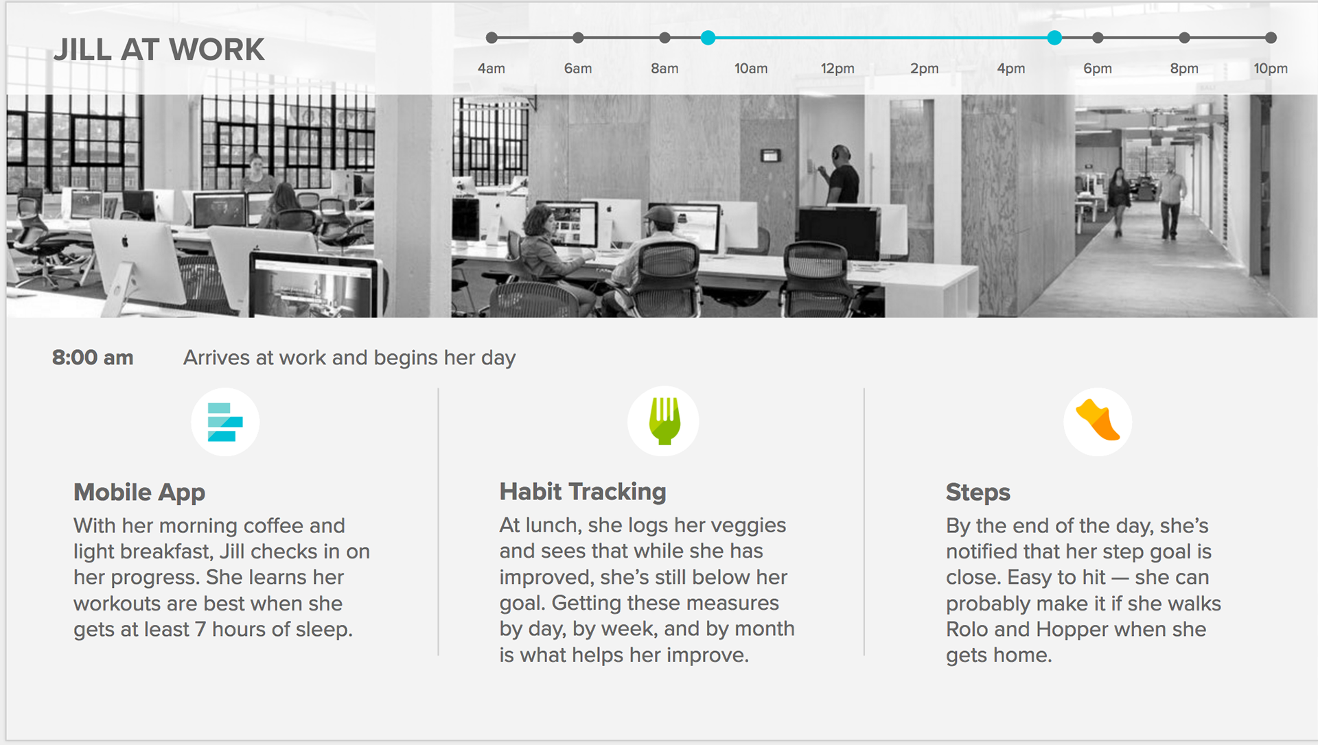
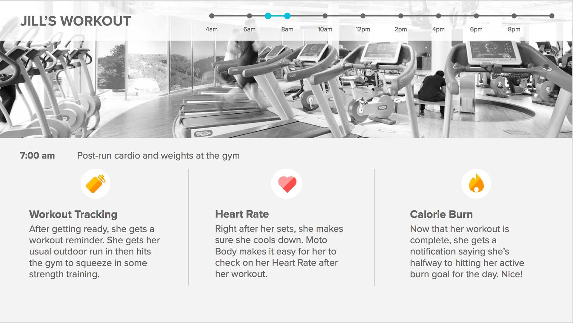
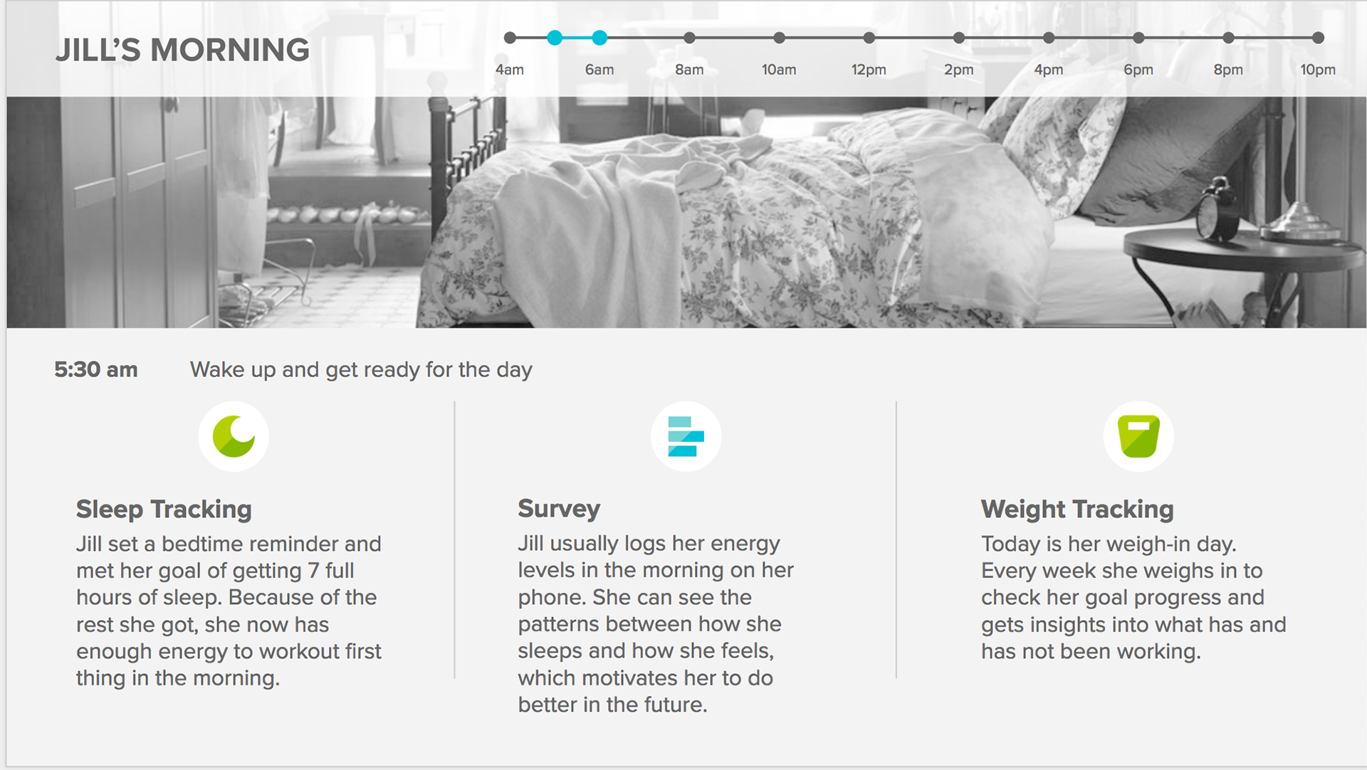
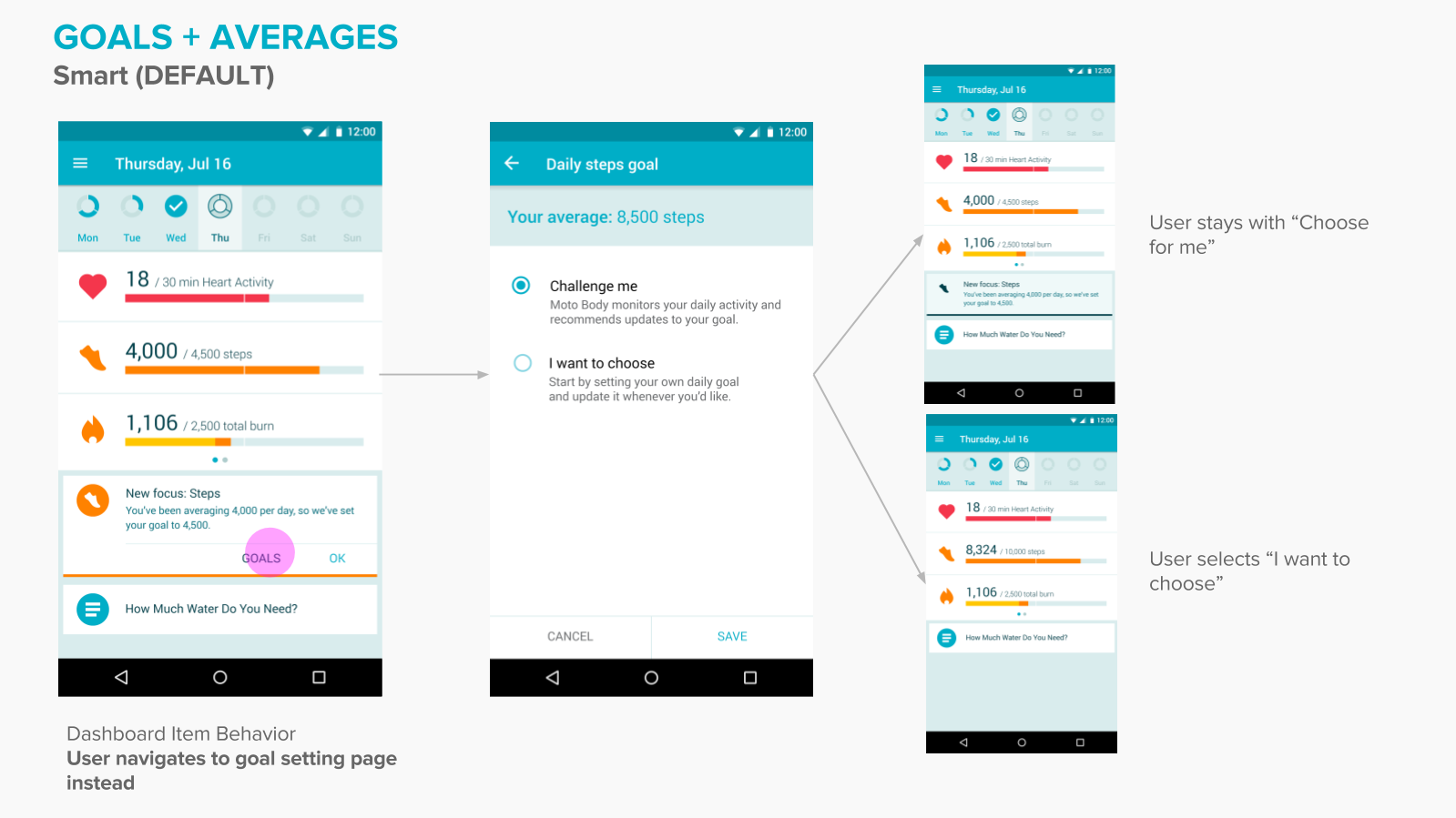
Using smart insights, we subtly challenge people to push themselves a bit further with encouraging language and small increases in their baseline goals.
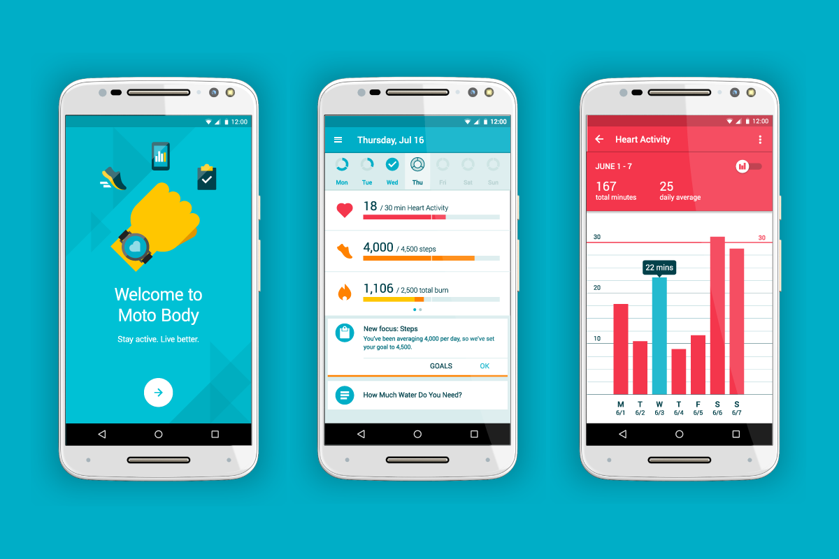
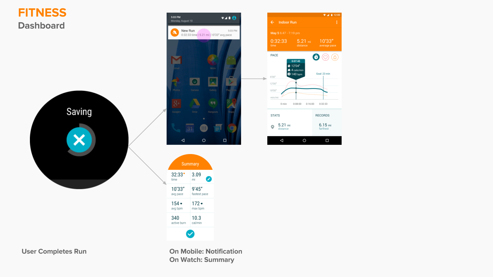
Moto Body works best as a system. Any info that the user records on their watch is seemlessly updated to their phone and they are provided aobut insights about their activity from Steps, to Active Heart Minutes.
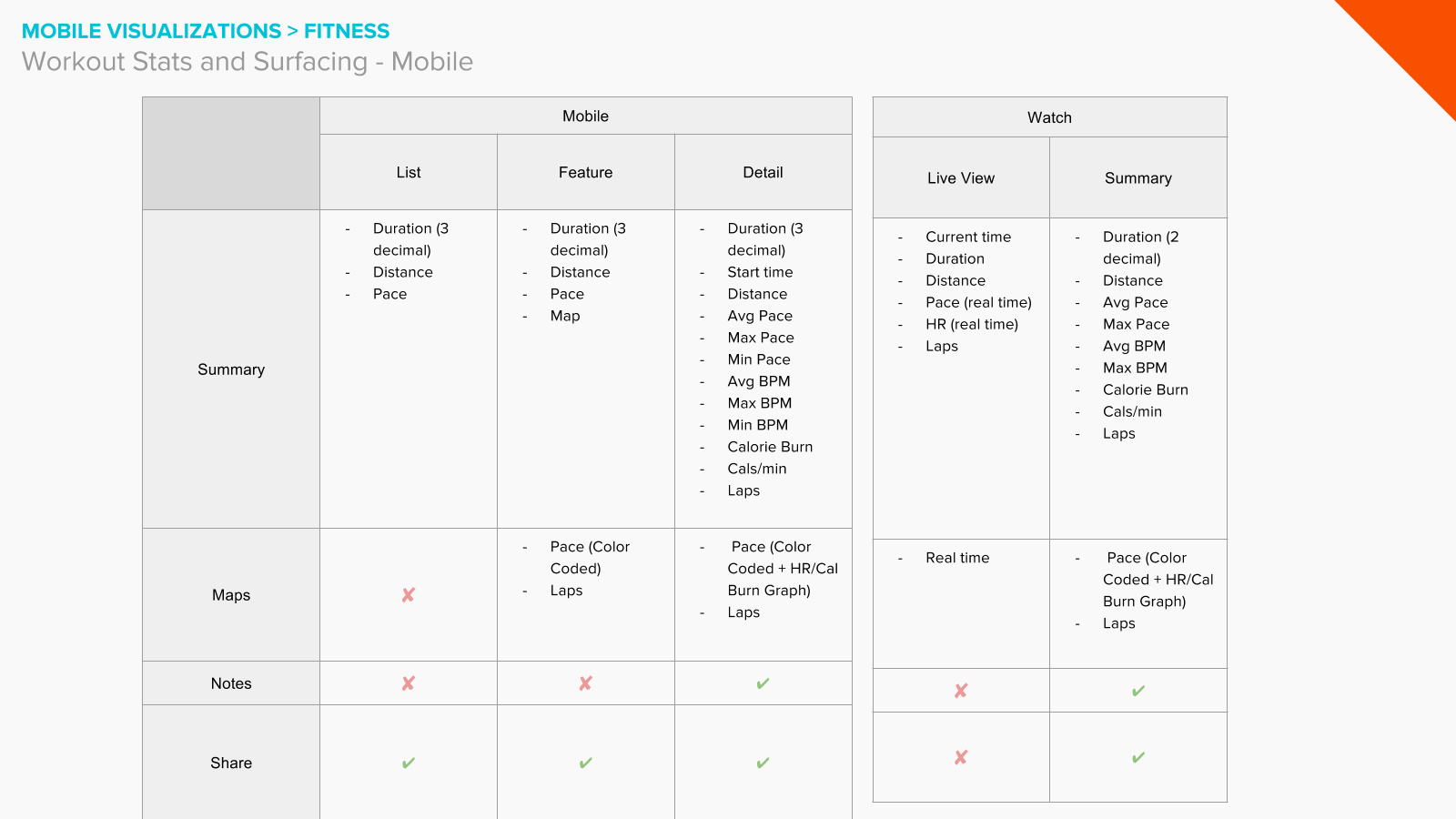
I spent most of my time on this project personally crafting a component of the running section of the app system where users can view their GPS data and statistics together, giving them a better picture of the pain points in their route, without being confusing.
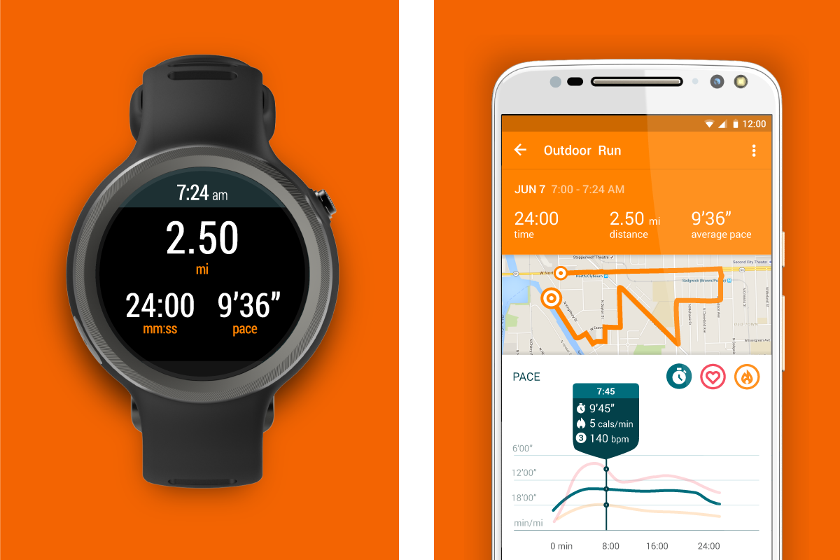
GPS and accelerometer data on the watch and reflected on the phone after a run is completed. The user can tap along the various points of the run timeline to see there data during that particular relevant point in time.
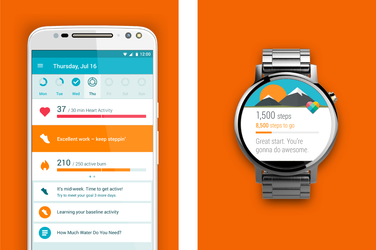
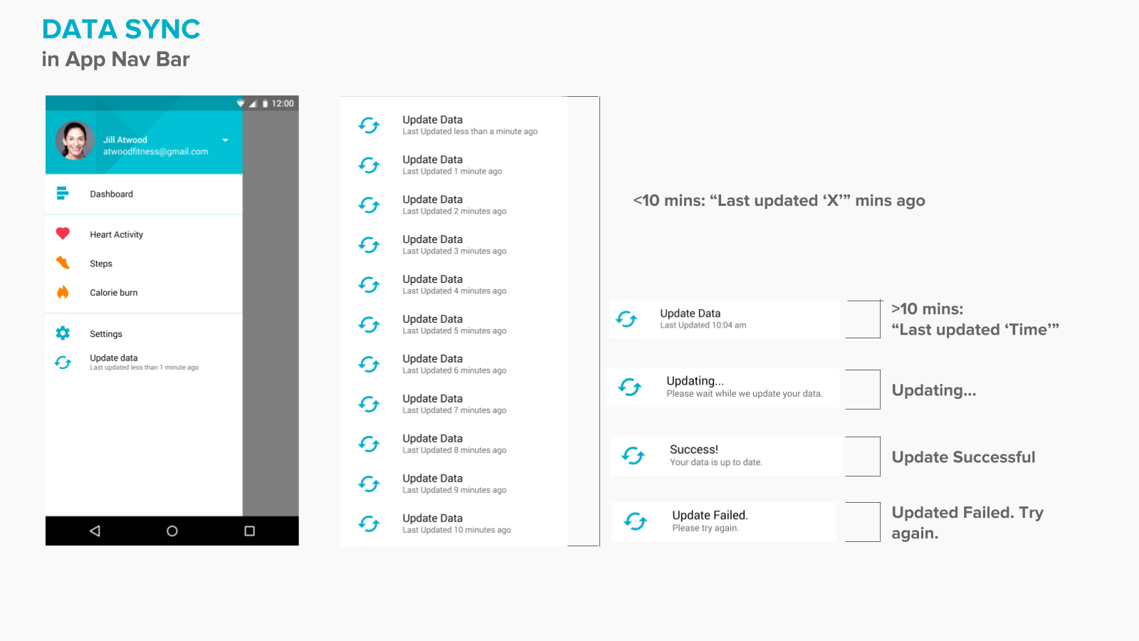
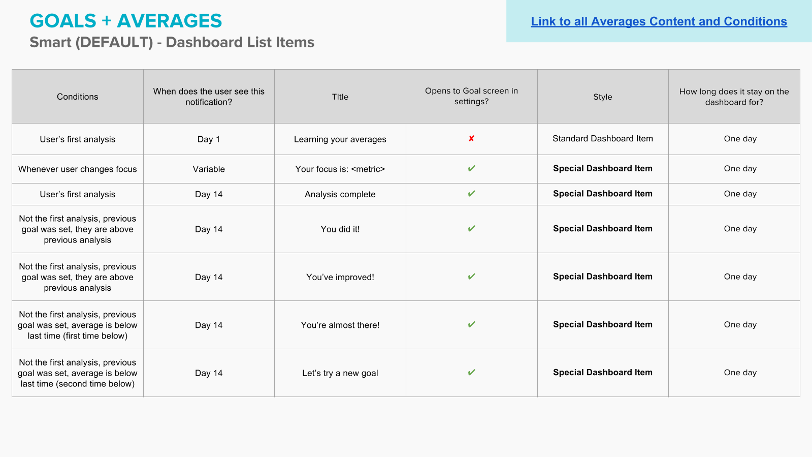
Giving users feedback about their progress towards their goals was one of the focus points of Moto Body. Figuring out when to surface such notifications provided a more natural experience between user and app that we hoped would mimic a fitness trainer or other source giving them smart feedback.
Working with dev teams from around the wolrold to both find more accurate ways to secure accurate GPS data and create new ways of displaying that info was difficult, but we eventually landed on a system that allowed users to see their route and the activity at glance.
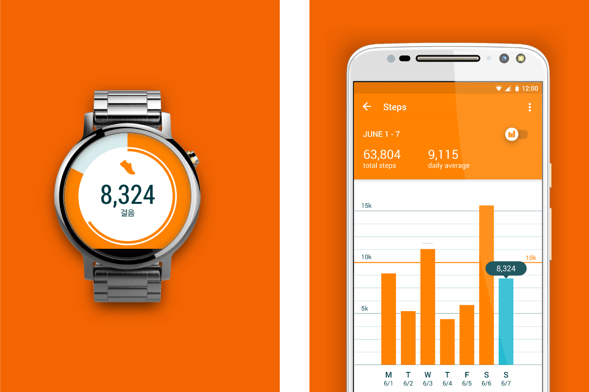
Steps data being shown on the phone and on the watch
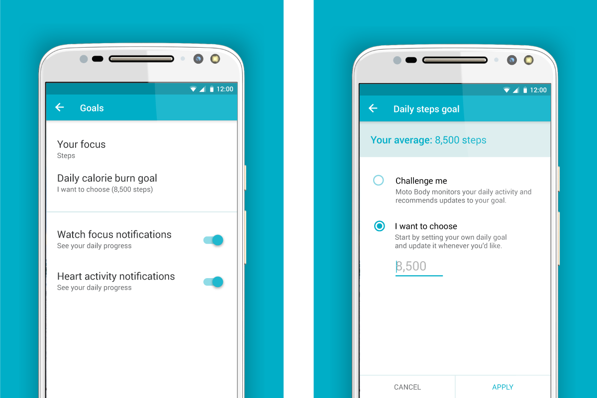
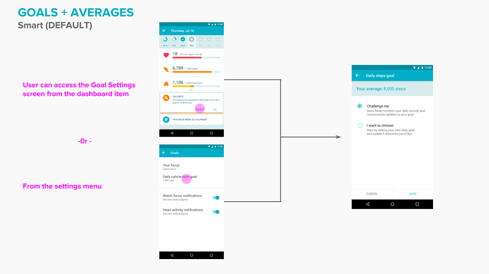
Goal setting in Settings
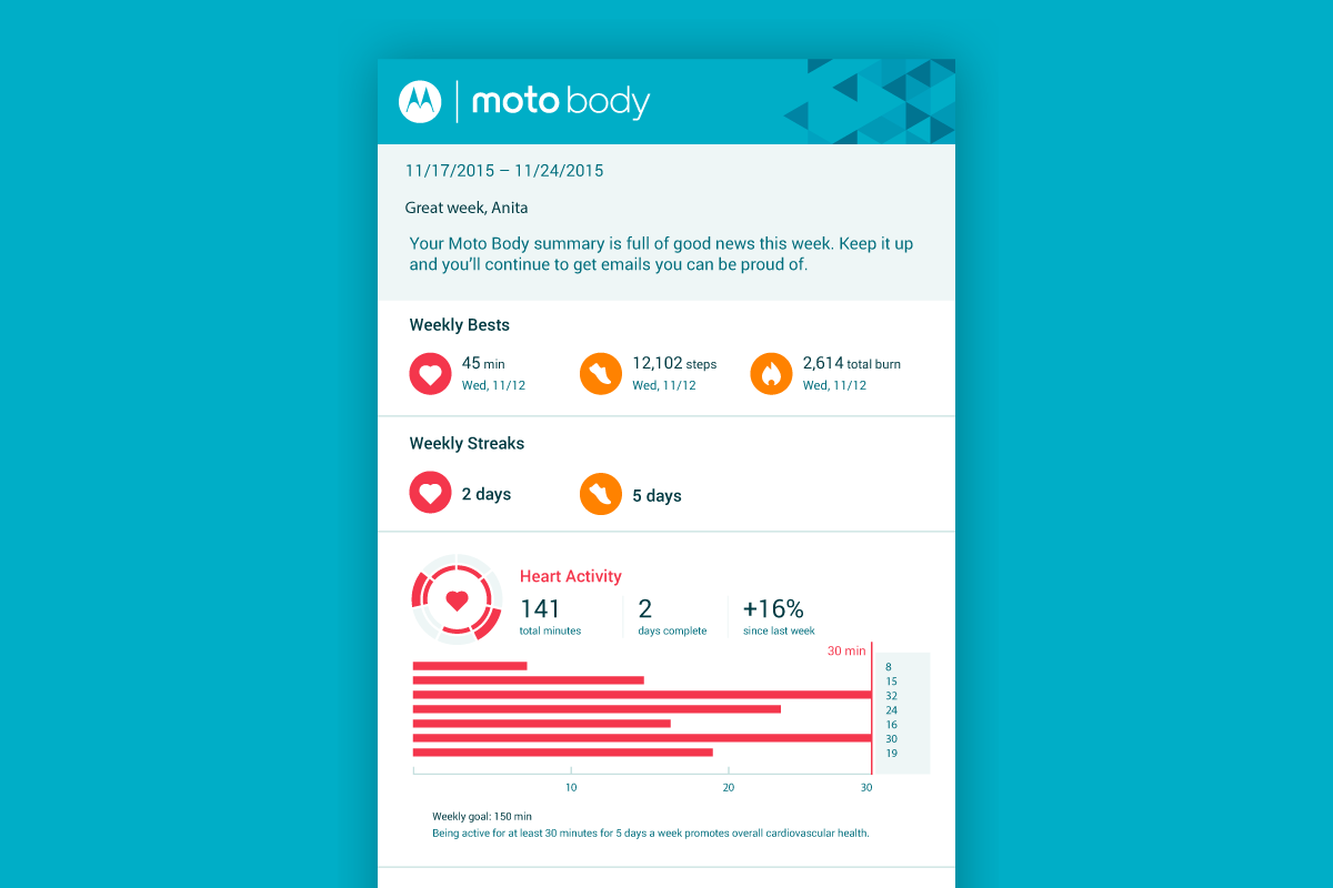
The experience for Moto Body, doesn't end on the phone. There are also email summaries that the user can interact with to see their goals over the course of weeks, months and years as well. These email summaries provide more high level insights on the user's activity.
The best part of working on Moto Body was the fact that it works together as a complete set. The watch component syncs seamlessly with the phone and email interfaces which gives users multiple ways to interact with their data and presented a real challenge to me as a designer. Juggling different interaction styles, numerous languages and leveraging different user needs made me a better designer, able to better keep all aspects of a system in mind.
Research
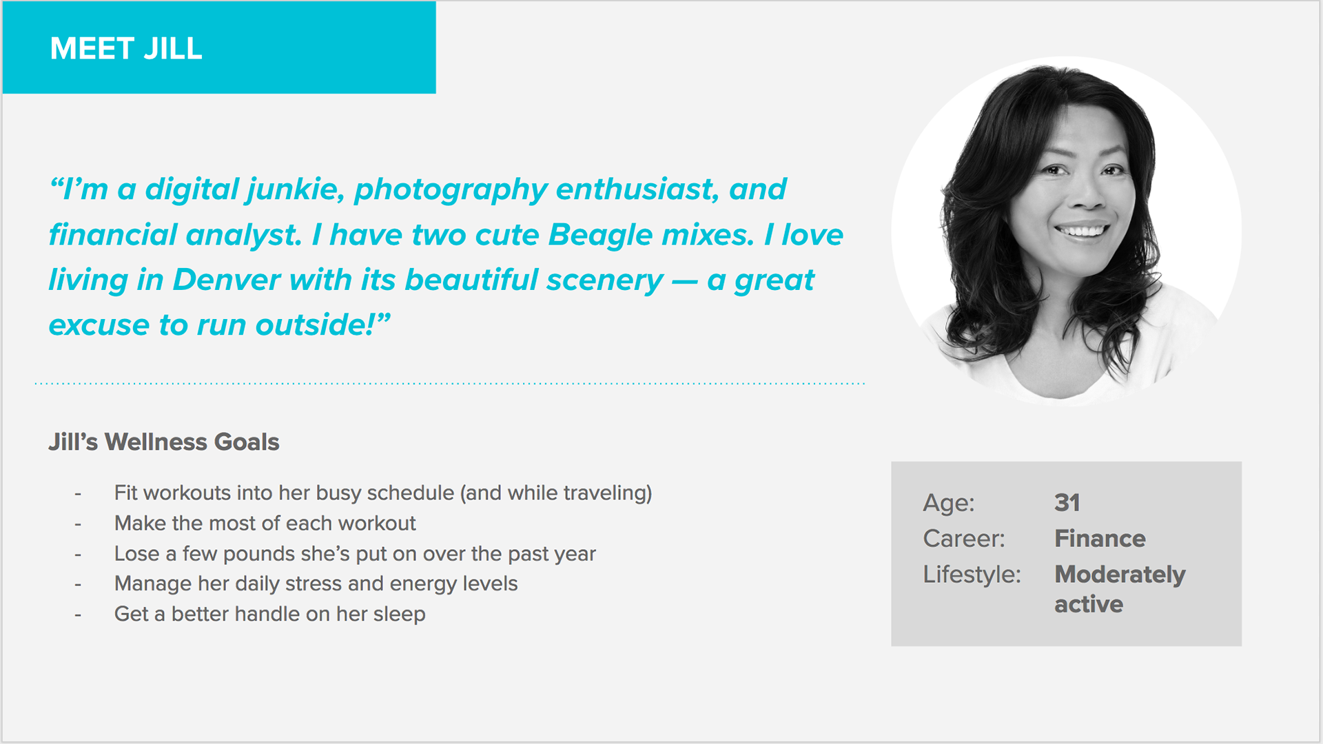
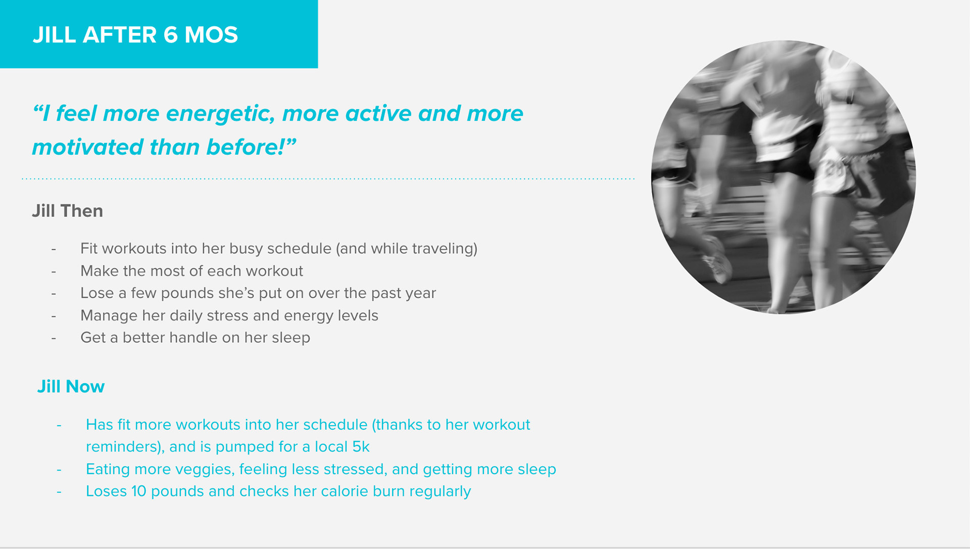
Persona and storyboard mapping exercise after interviewing users on their fitness habits and daily lives.
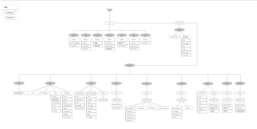
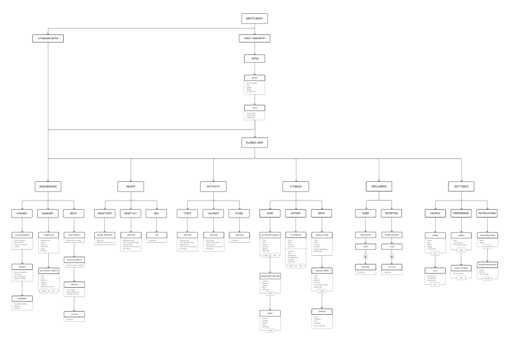
Information Architecture. My original proposal, versus the final version worked on in collaboration with the rest of the team.
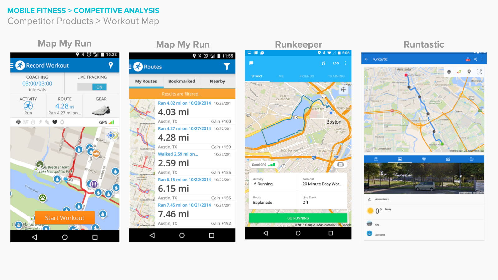
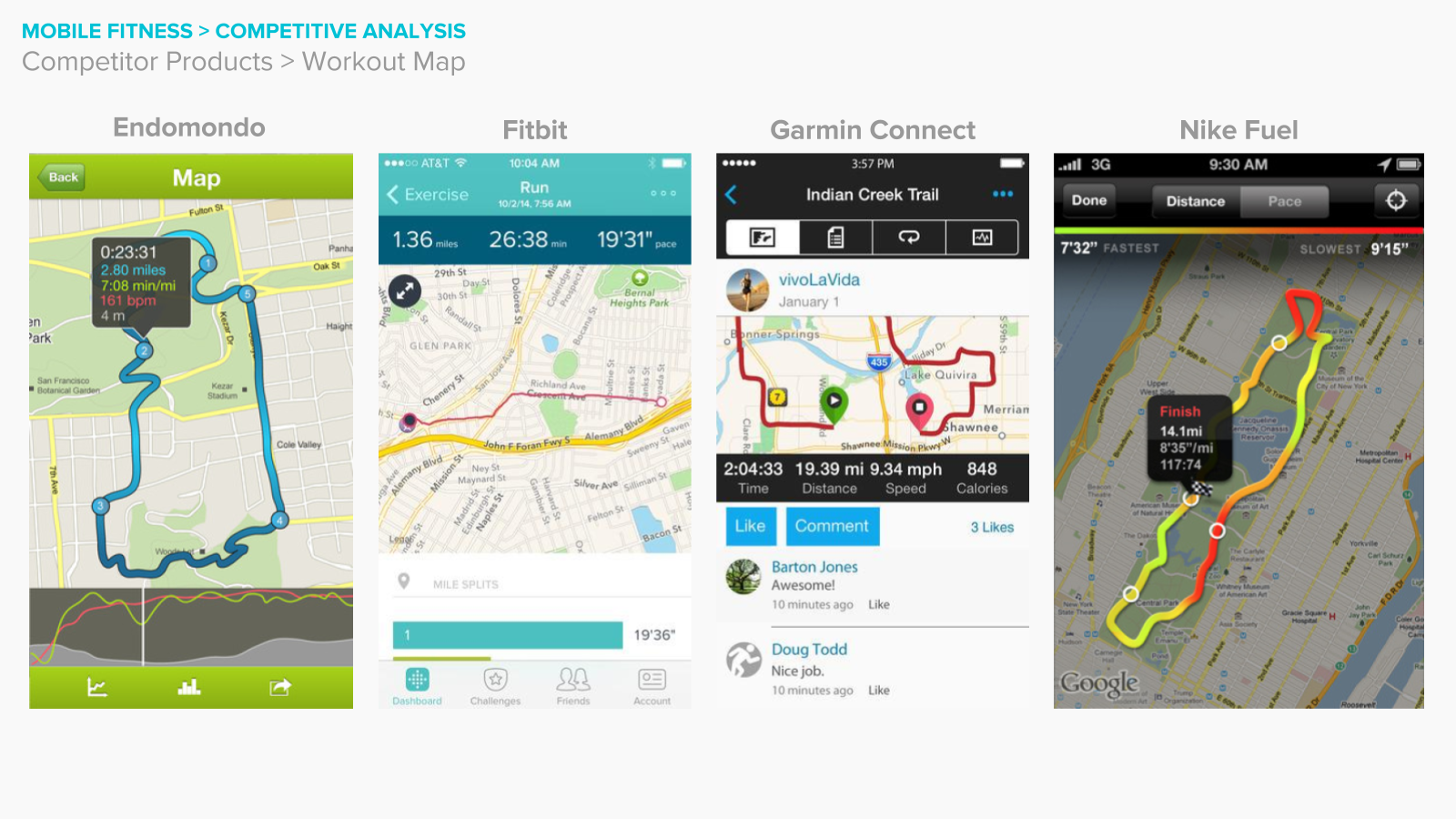
Because I was very singularly focused on crafting the map overview for the fitness summary pages, I did much of the competitive analysis or benchmarking of experiences across the industry to see what trends were expected from a users point of view.
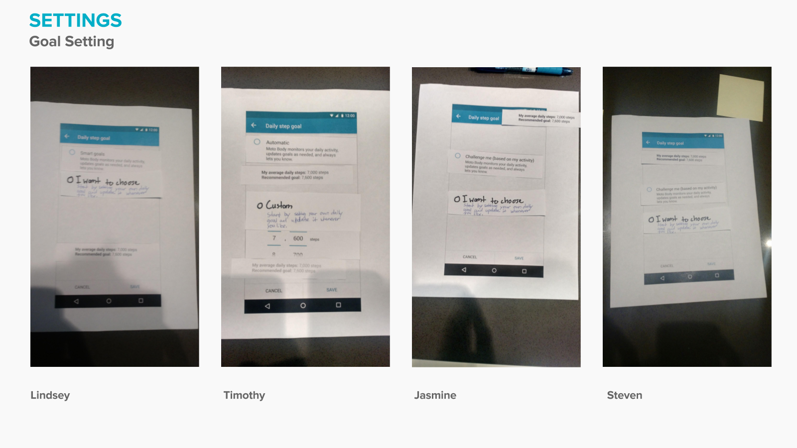
Along with the research team, we were responsible for conducting research with users, down to every detail. This is a screenshot from a test that I conducted around the ability for the users to opt into and out of computer assisted goals. We did testing almost every sprint (for more detailed examples, please contact me directly).
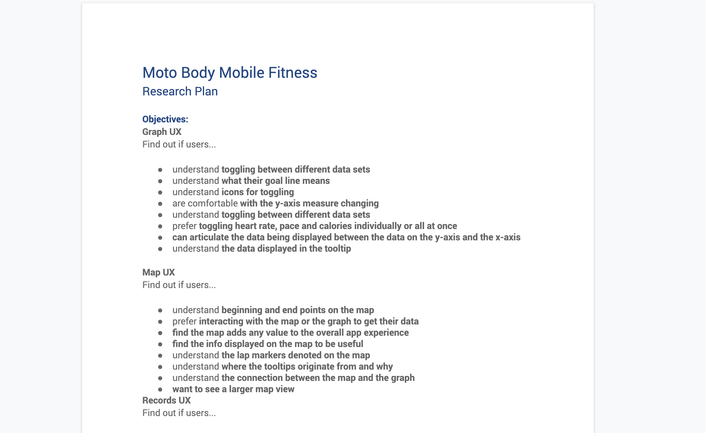
Example Research Doc I drafted with the research team.

An assortment of other process work for the fitness experience including interaction notes and color studies.
Results
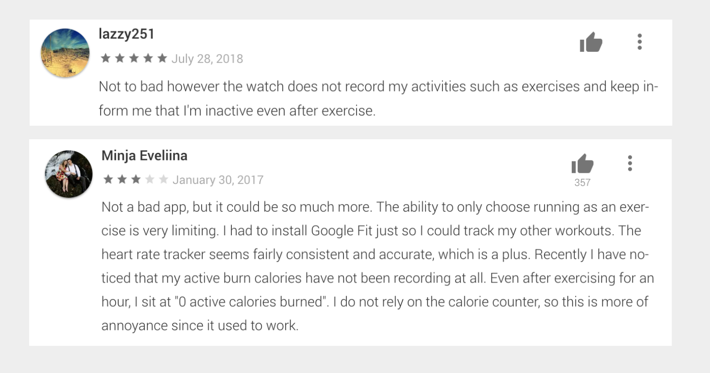
User feedback on launch.
Users overall liked the experience, but many compained that they felt that the limited scope of our app being running-oriencted only hurt their overall experience.
© Copyright 2019 garvey smith