Moto Display
UI, UX, Research
Everything you need to know, at a glance
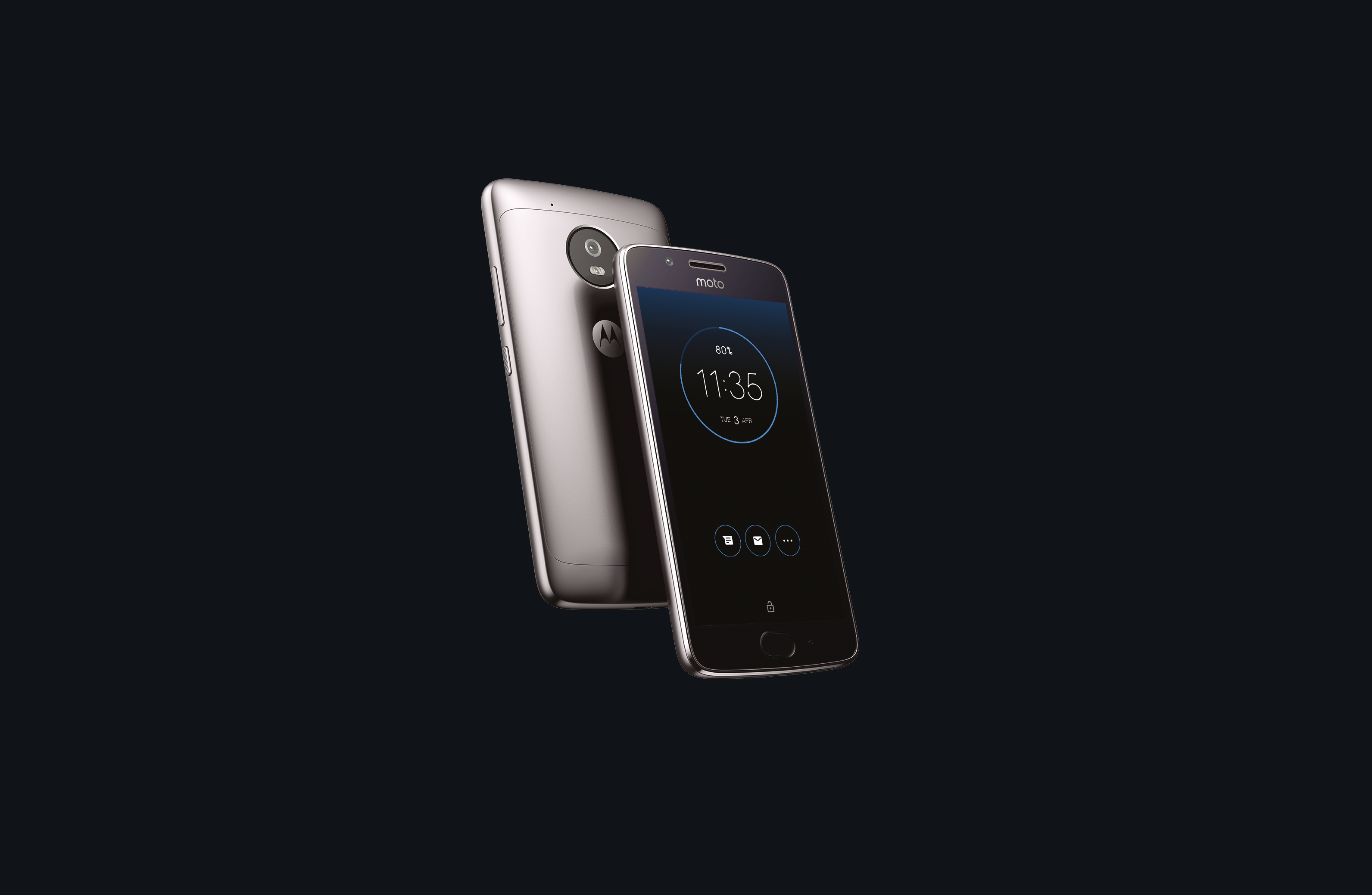
Moto Display has been a featured experience on Motorola phones since the release of the first generation Moto X in 2013. Surfacing info to the user in the moment, Moto Display serves a dual purpose: show information that is timely to the user and use as little energy as possible to conserve battery. With each implementation of Display, users have been able to enjoy an experience that makes Moto phones stand apart form the competition. White this update, I was lucky enough to assist in the UI and subtle animations.

Moto Display on the Moto G5, a mid tier phone, showing that low price, shouldn’t mean less robust experiences. The slight hint of color at the edge of the display adapts to the users wallpaper, bringing a sense of style from the inner UI elements, to the outside.
Goal Create a dynamic lock screen experience for Moto users that allows them to view their notifications and take action from the same screen
Why? Giving users more dynamic lock screen behavior would allow us to leverage adaptive brightness features to make the screen more legible at night, give access to features unique to Moto devices, create a recognize-able style and help us stand out among competitors
Key Flows
- IBattery feedback
- Notifications
- Music playback
Team:
9 total
Software Dev ••
Hardware Dev •
Project Managers •
Product Strategy •
UX Design (Remote: São Paulo) •
UX Research •
Visual Design (1 remote: São Paulo) ••
My role:
Visual Design
Prototyping, UI Design, User research (interviewing/qualitative)
Although simple-looking, fine-tuning darkness of the UI to make it both glanceable and legible involved many iterations of light testing, both indoors and outdoors. Myriad color choices were tested and a variety of font weights and opacities tested.

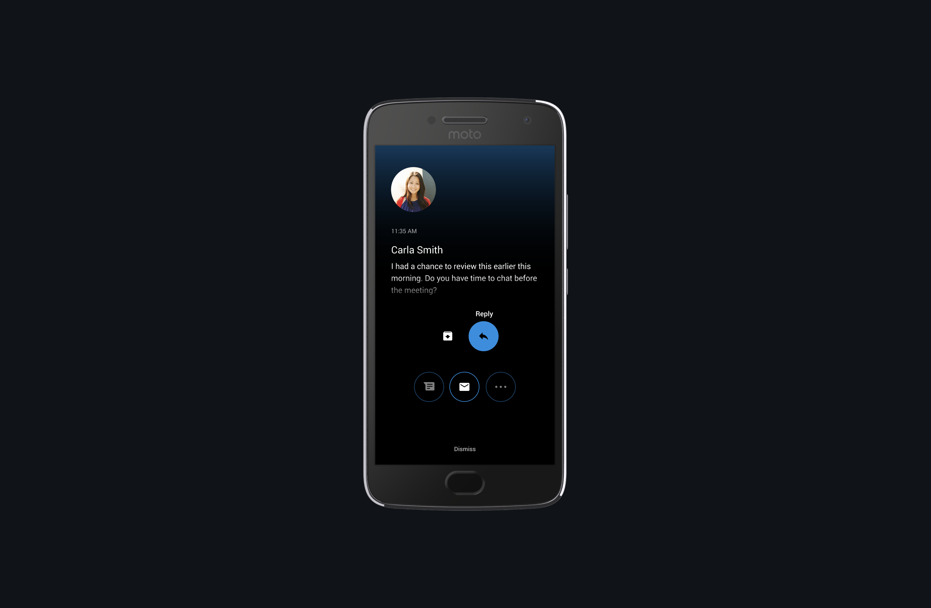
Above is an example of interacting with a notification. As the user interacts with Display, they create a trail of color that clues them in to what they are selecting and provides helpful feedback.
More example interactions on Moto Display, from texting to music to navigation.
© Copyright 2019 garvey smith