Moto Voice
UI, UX, Research
How do you craft a voice UI for
users across the world?
Moto Voice is a voice assistant that has been featured on Moto products since 2013. At the time it was originally in introduced, voice assistants like Siri, Alexa and Cortana were uncommon. Because of this fact, while the algorithms at allowed Moto Voice itself to adjust to the needs of its users and become smarter over time, the tutorials and prompts felt dated and over-explained what the service aimed to do to users. This, coupled with more global demands in markets like China and Brazil, meant that Moto Voice was in need of a makeover.
Goal Deliver a best in class voice assistant that offers features unique to user needs across the world
Why? While it was becoming obvious that voice would be a common interaction paradigm, it was still in its nascent phases. We wanted to be a leader in integrating this new product with our devices.
Key Flows
- Conversation Mode (China)
- Tasks Mode (US + Brazil)
- Send a message
- Driving + Navigation
- "Tell me about my day" flow
Team:
15 total
Software Dev (3 remote: Bangalore) ••
Hardware Dev ••
Project Managers •
Product Strategy •
UX Design (2 remote: 1 São Paulo, 1 Beijing) •••
UX Research (1 remote: Beijing) ••
Visual Design (2 remote: Shanghai)••••
My role:
Visual Design
UX System Map, Prototyping, UI Design, Persona Mapping, User research (interviewing/qualitative)
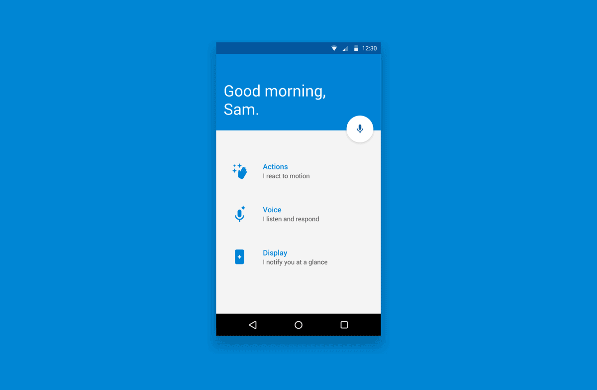
Moto Voice, now just as stylish as it is savvy
For Moto Voice, I focused on making the new UI consistent, rather than flashy. There's so much functionality that happens "under the hood", that instead of revealing it and overloading the user, I felt that it made more sense to focus on how the information is surfaced to the user and how they would be able to act upon the information they requested.
The components of the voice UI: the bubble, FAB and Feedback cards. These elements give the user feedback on web whether Moto understood the request and time until the action received is completed as simply as possible.
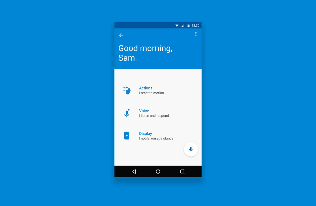
Another early iteration of the app interior pages. The full screen takeover, while a bit more visually simplified, presented the added challenge of allowing users to see that the system registered their responses. We eventually settled on the half-screen feedback area instead, as this proved to assure users during testing.
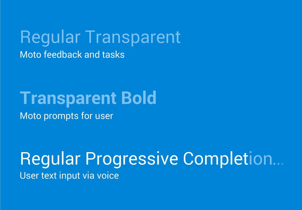
An example of how subtle typeface changes nudge the user towards being aware of Moto Voice’s response.
Overall, I think I was successful at creating a simple, but comfortable environments for users of any background to communicate with Moto Voice. Visits with the China team and frequent collaboration with eh teams in Brazil and India, proved to provide insights into UI interactions that folks in those countries were used to interacting with.
© Copyright 2019 garvey smith